Abu Ansab
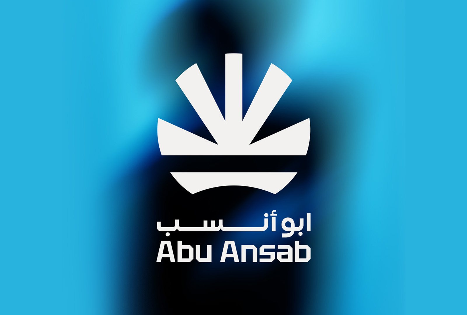
Where it started
Abu Ansab is an FMCG brand. When the project came to me, the client already had an idea in mind: an icon built from the letter A, the first letter of the name.
It is a reasonable request. Plenty of good logos start from a letter. But while I was looking at the market, I noticed that one of their biggest competitors already used a logo built around the first letter of its own name.
In FMCG that matters. Products sit next to each other on the same shelf, and people decide in a second or two. If two brands lean on the same idea, the newer one starts to look like a copy, even when it is not.
Two routes on the table
So I did both. I designed a few A-based concepts, because that was what the client had asked for and they deserved to see it done properly. Alongside them, I developed a different direction that had nothing to do with the letter.
I honestly expected the letter concepts to win. They did not. The client responded to the symbol almost straight away, and once I walked them through the meaning and the thinking behind it, they were sure. That became the direction.
Reading the symbol
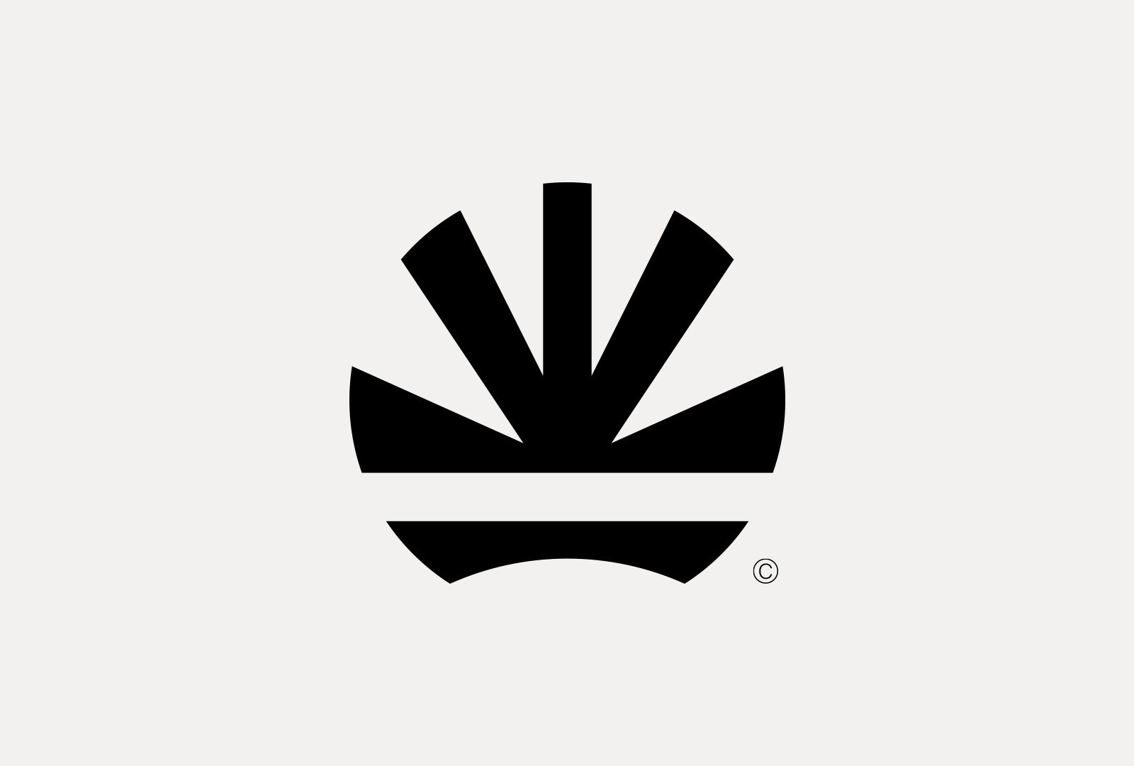
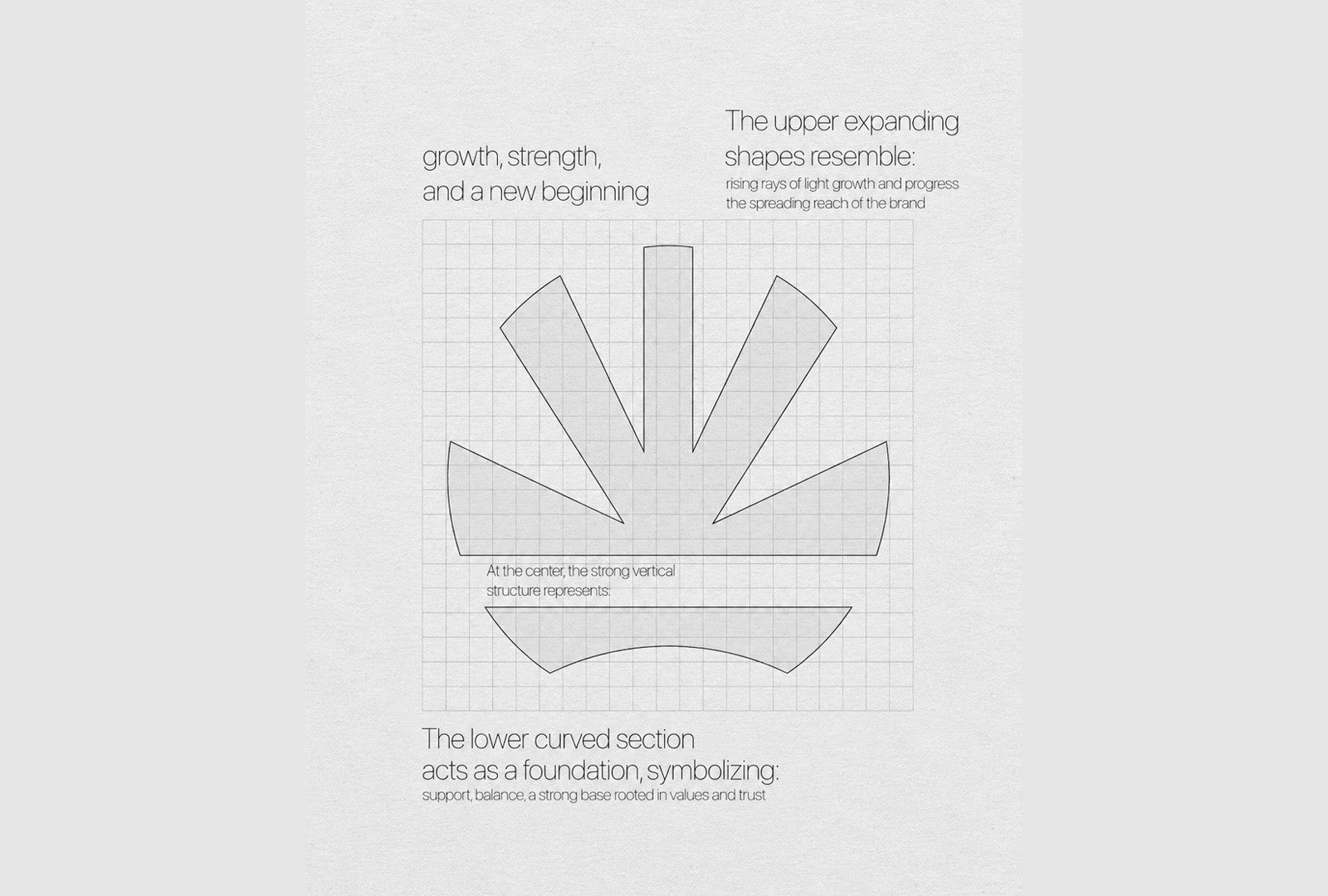
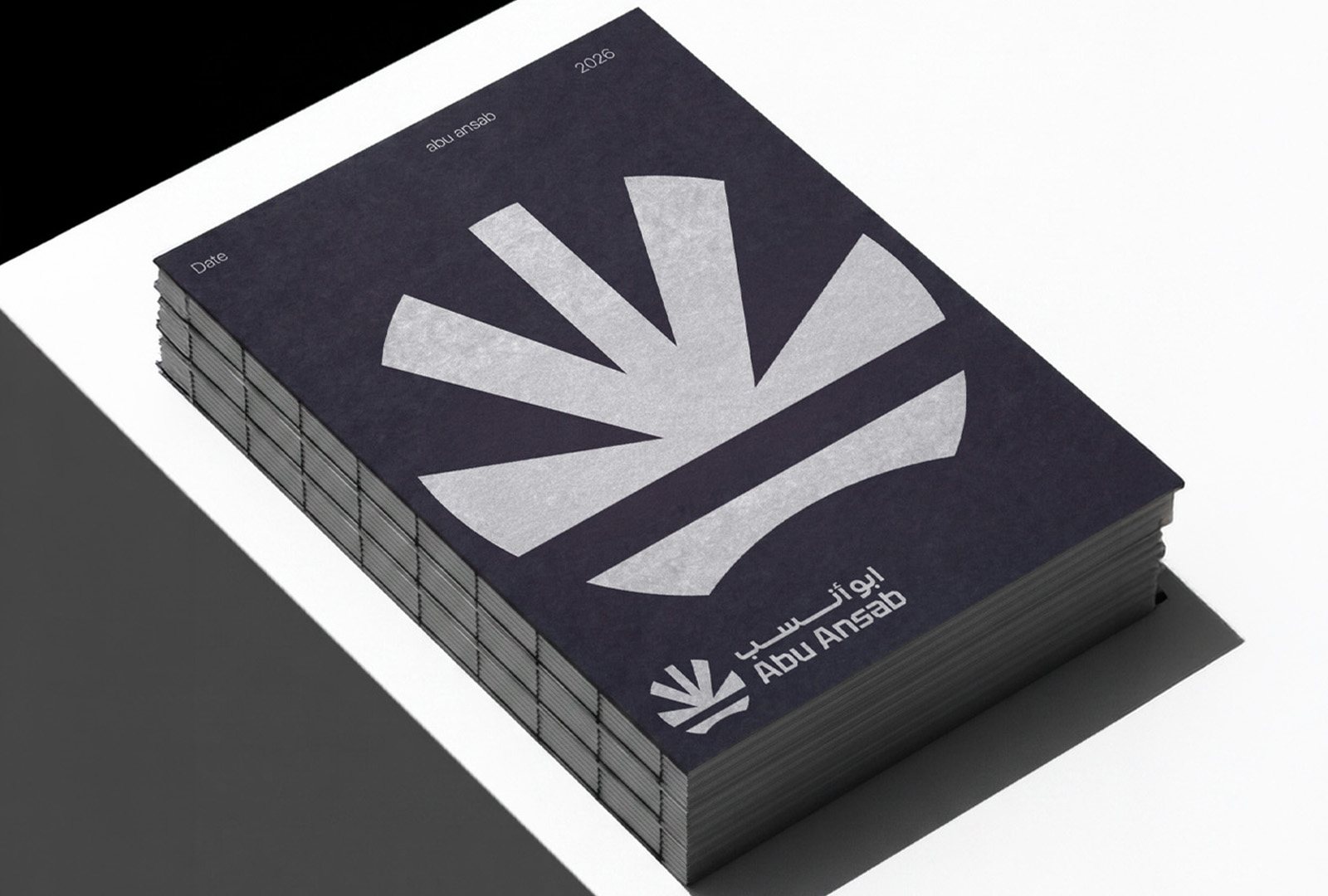
The mark is built from three parts, and each one carries a piece of the story.
The rays at the top open outward like light at sunrise. They stand for growth, progress and the reach of a brand that wants to keep expanding.
At the centre, a strong vertical form is created by negative space. You do not draw it, you see it in the gaps. It stands for stability, confidence and leadership.
The curved base holds everything up. It is the foundation: support, balance and a brand rooted in values and trust.
Put together, the symbol says one simple thing. Abu Ansab wants to grow and move forward, without losing its footing.
A brief tells you what the client wants. Research tells you what the brand needs.
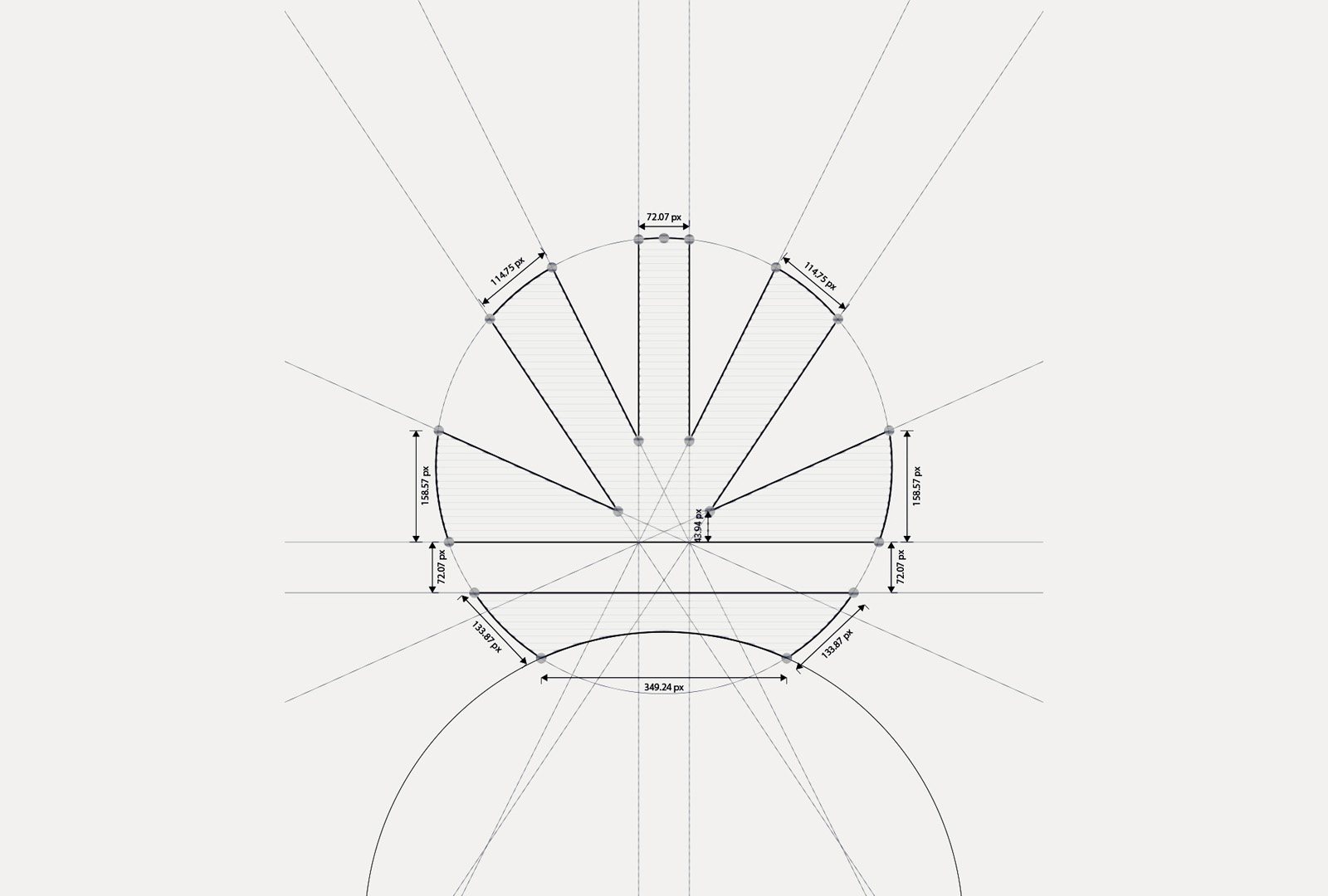
Built on geometry
Behind the simple shape there is a strict structure. Every ray sits on a single circle, and the angles are mirrored so the mark feels balanced from every side.
The details repeat on purpose. The central ray and the gap that separates the rays from the base share the same width, so the whole mark holds together as one system. The rhythm feels right even if nobody ever measures it.
The wordmark pairs Arabic and English in a matching geometric style, so the two scripts sit together as one lockup instead of two separate logos.
What I took away
The client was not wrong to ask for an A. They just had not seen the competitor problem yet. My job was to spot it, offer another way, and still respect what they had asked for.
Showing both routes made the decision easy. When people can compare, and they understand the thinking, they usually choose the stronger idea on their own.
Next project
Panther