BEC
Where it started
BEC, short for Business Elite Club, is a newly launched business community. It brings people together to grow, connect and do business.
When the client came to me, the problem was clear. BEC had no unified identity. Different pieces looked different, so people struggled to recognise them, and the brand felt inconsistent before it had even found its feet.
They needed a strong, cohesive identity that would make BEC look like what it is: a serious, professional community.
The task
The brief went beyond a logo. We needed a brand design strategy that would communicate what BEC stands for: its values, its expertise and its reliability.
That meant a wordmark, a full visual identity, and a plan for how it would live on stationery and outdoor advertising. The goal was a brand image people would remember after seeing it once.
An arrow inside the B
A business club is about moving forward. Members join because they want progress, for themselves and for their businesses. I wanted the wordmark to carry that idea without adding a separate symbol.
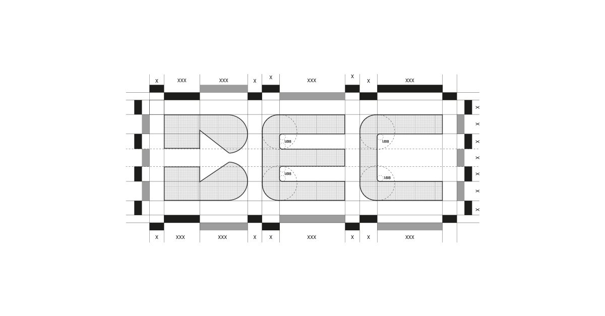
So the arrow lives inside the letters. The counters of the B are cut into a single arrow pointing forward. Read it quickly and you see BEC. Look again and you see the direction.
The letters are built on a strict grid with a shared module, and the curves follow the golden ratio. That is what makes three simple letters feel balanced and solid at any size.
Let's move forward together.
One identity everywhere
With the wordmark in place, I built a consistent visual identity around it. A confident red and a warm cream form the palette. Clean, bold type supports the wordmark without competing with it.
Every piece now uses the same colours, the same type and the same arrow, which is exactly what BEC was missing. Consistency is what turns a logo into something people recognise.

Out in the world
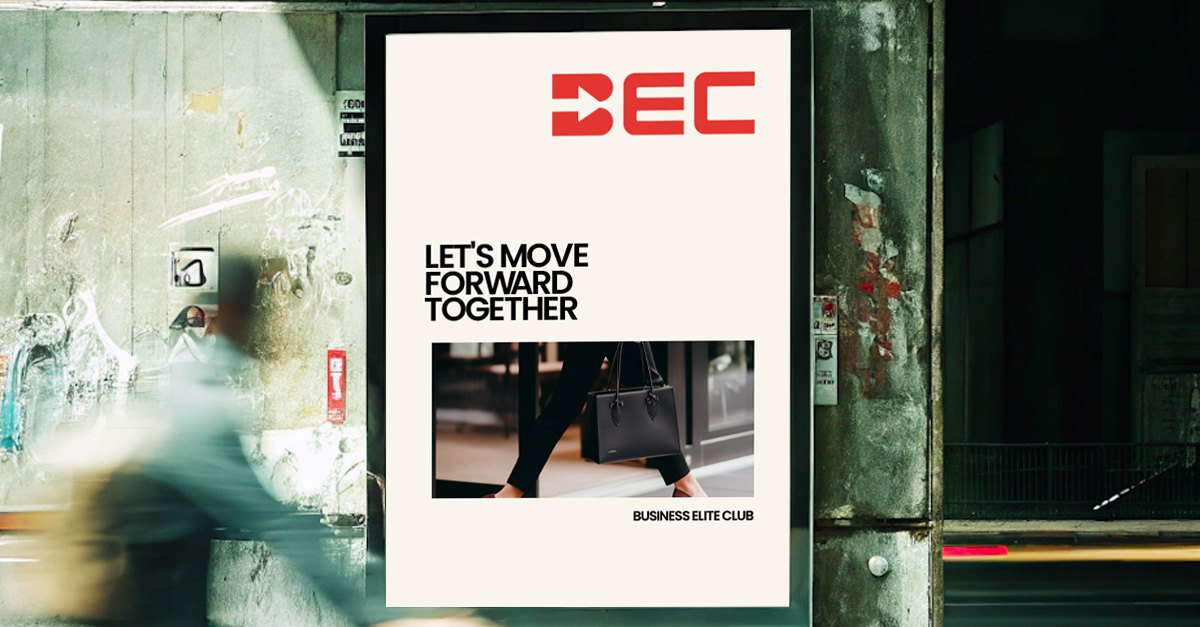
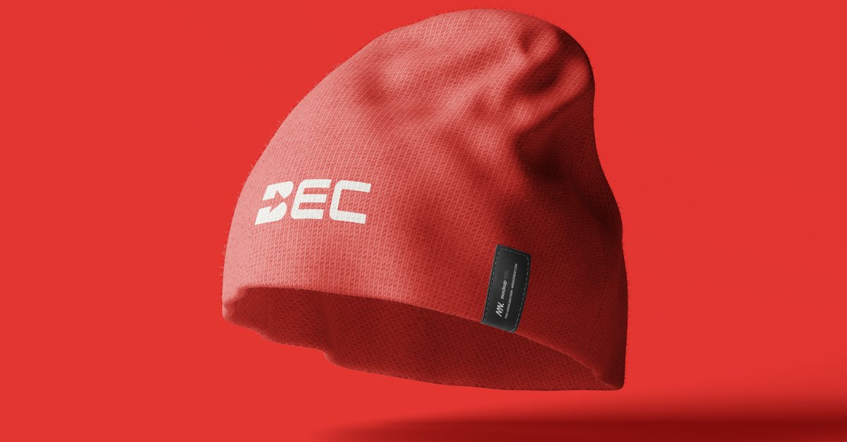
The identity carries through stationery, outdoor posters and merchandise. On the campaign, the line Let's move forward together says out loud what the arrow says quietly.
Turn the wordmark on its side, as on the tote bag, and the arrow points upward. Forward or up, the message stays the same.
What I took away
Recognition does not come from one clever logo. It comes from doing the same thing well, everywhere, every time.
The best place to hide an idea is often inside the name itself. BEC did not need an extra icon. It needed its own letters to work harder.
Next project
Crab Haus