Crab Haus
Where it started
Crab Haus is a new, independent production company. They make everything from commercial shoots to indie films, and they wanted a brand that felt bold, modern and a little unexpected.
They already loved the name. What they did not want was a typical production logo: another film reel, clapperboard or play button.
The line that stuck
Early on, the team told us something that changed the whole project:
"We don't just move forward. We move sideways and backward, wherever the story takes us. Like a crab."
That line stayed with us. It explained the name, and it explained how they work. Creative work is rarely a straight line. Good teams follow the story wherever it goes.
A crab inside a lens
We built the identity around two ideas. The crab stands for the unpredictable, adaptable side of creativity. The camera lens stands for focus, perspective and storytelling.
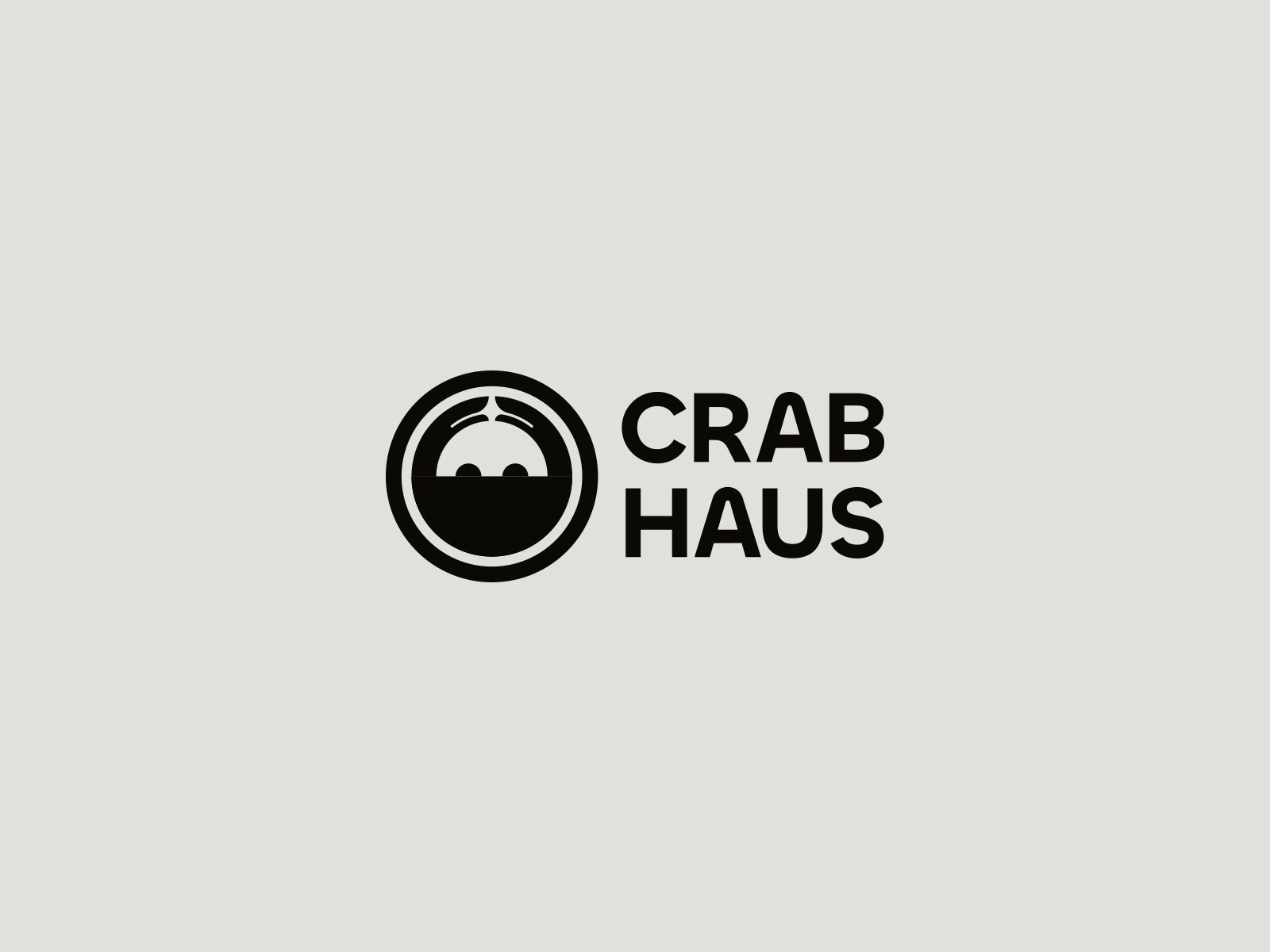
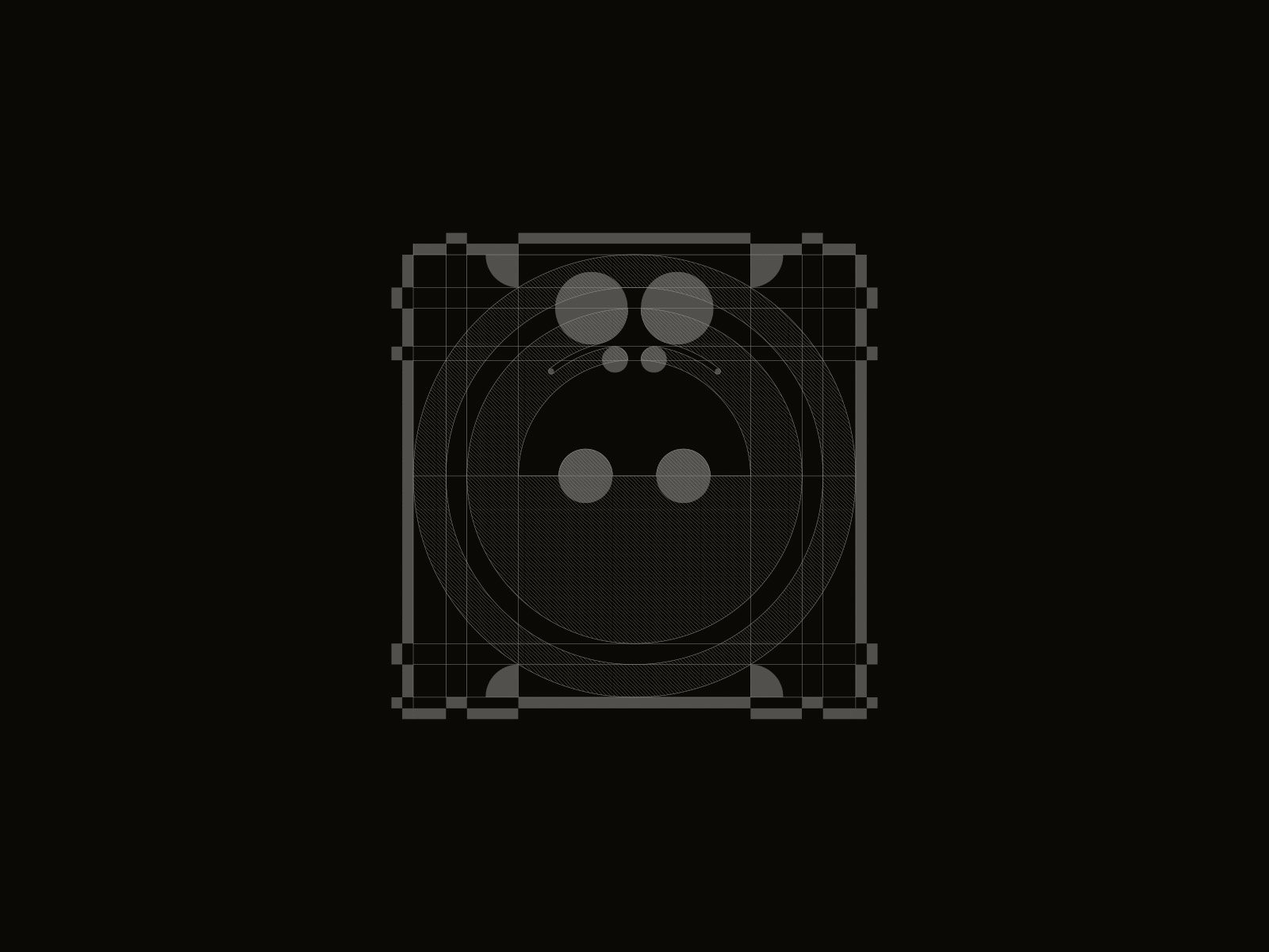
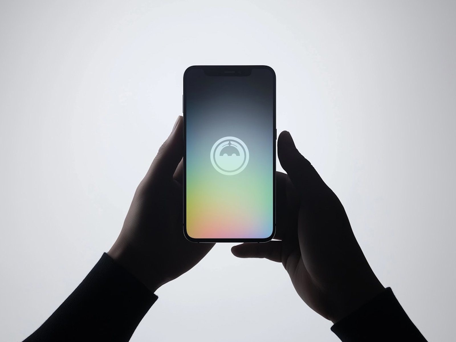
Rather than choosing one, we combined them. The crab sits inside a circular lens, its body peeking up with two round eyes, the claws drawn as a simple arc at the top. It is subtle, but once you see it, you cannot unsee it.
Everything is built from circles on a strict grid, so the mark stays clean and modern while still feeling a little playful.
We don't just move forward. We move sideways and backward, wherever the story takes us.
Visual language
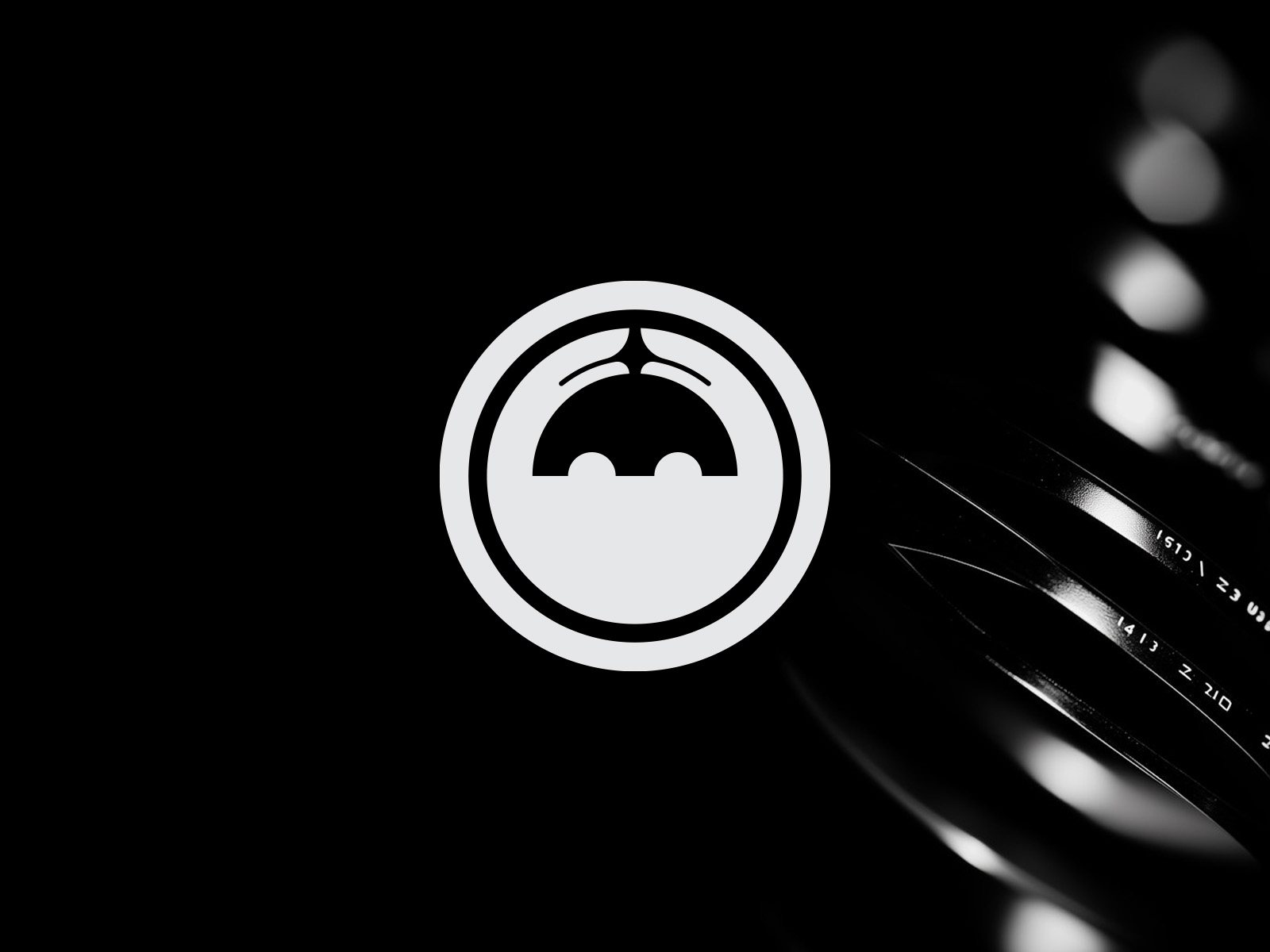
The palette is cinematic: deep blacks and soft metallic greys, so the brand feels premium and lets the work itself bring the colour.
The type is strong and minimal, with rounded letters that sit comfortably next to the circular mark. The system works across digital, print and motion, from social media posts to the opening seconds of a film.
Where it landed
Crab Haus now has an identity that stands apart in a crowded industry. The logo is not just a symbol. It carries a story about flexibility, creativity and a love of unusual perspectives.
The best brand ideas often come from the client's own words. Our job was to listen closely enough to hear them.
Next project
Corlando