Forge Destinations
Where it started
Forge Destinations is a travel brand. They needed a mark people would remember, something that felt like travel without looking like every other travel logo.
The first thing I did was look at what was already out there. Airplanes, location pins, globes, suitcases, compass needles. Almost every travel brand picks one of these. They make sense, but they are so common that people stop seeing them. Put five travel logos side by side and you would struggle to tell them apart.
So I asked a different question. Not what does travel look like, but what does travel feel like.
Finding the idea
I kept thinking about people who travel because they are curious, not just to tick places off a list. They want to see what is past the next border.
That reminded me of migratory birds.
Every year these birds cross countries, seas and continents. Nobody hands them a map or books their route. They just know when it is time to move. They leave home, go somewhere new and come back again. That is very close to what good travel is: leaving what you know and coming back a little different.
An airplane is about getting from A to B. A bird felt more alive than that. It is about the journey itself.
Shaping the emblem
Once I had the idea, the hard part was keeping it simple.
A bird can easily turn into an illustration, with feathers, details and too many lines. That works on a poster, but not on a phone screen, a boarding pass or a small profile picture. The mark had to hold up at every size.
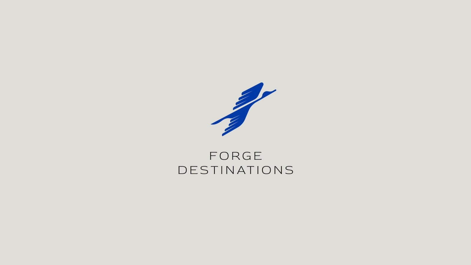
So I kept taking things away. The wings stayed, because they carry the movement. The angle stayed, because a bird mid-flight feels like it is going somewhere. Everything else went.
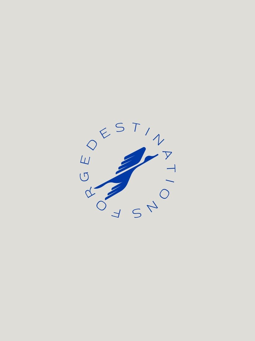
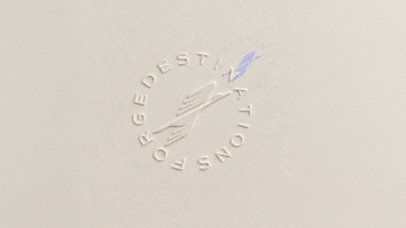
The name wraps around the bird in a circle, like a stamp in a passport. Read it fast and you see motion. Look again and you see the bird.
Design is not just about making something look good. It is about finding a meaningful idea and saying it in the simplest way possible.
Taking it into the campaign
A good mark should give you more than a logo. The bird gave the campaign its voice almost on its own.
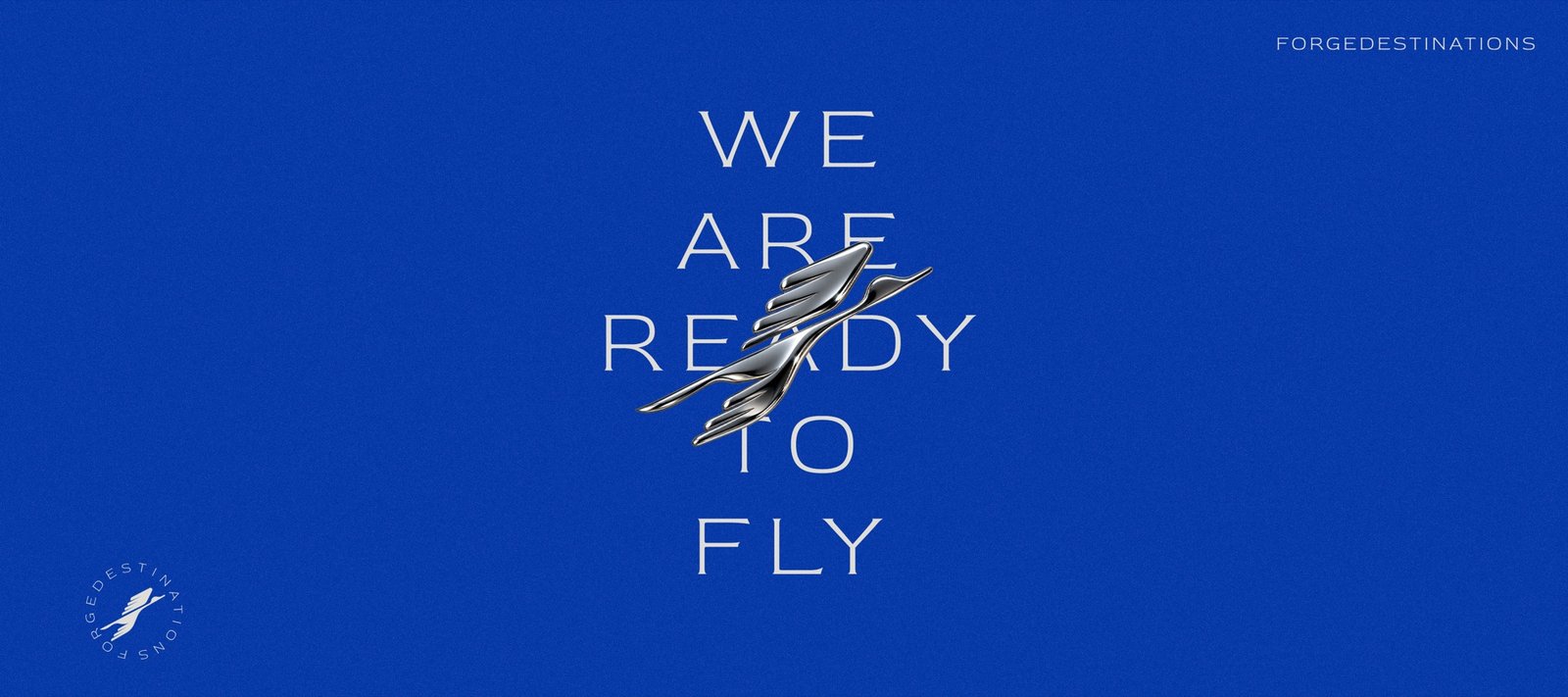
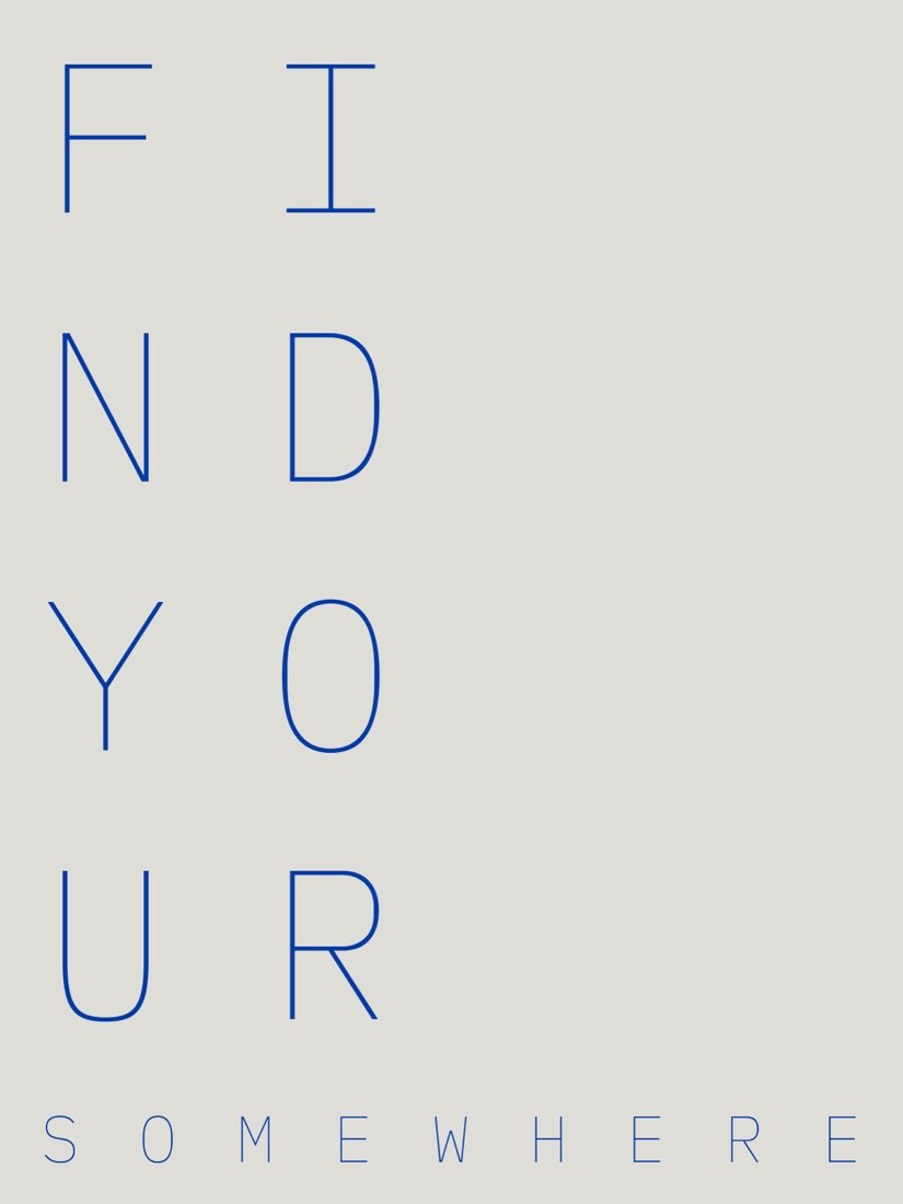
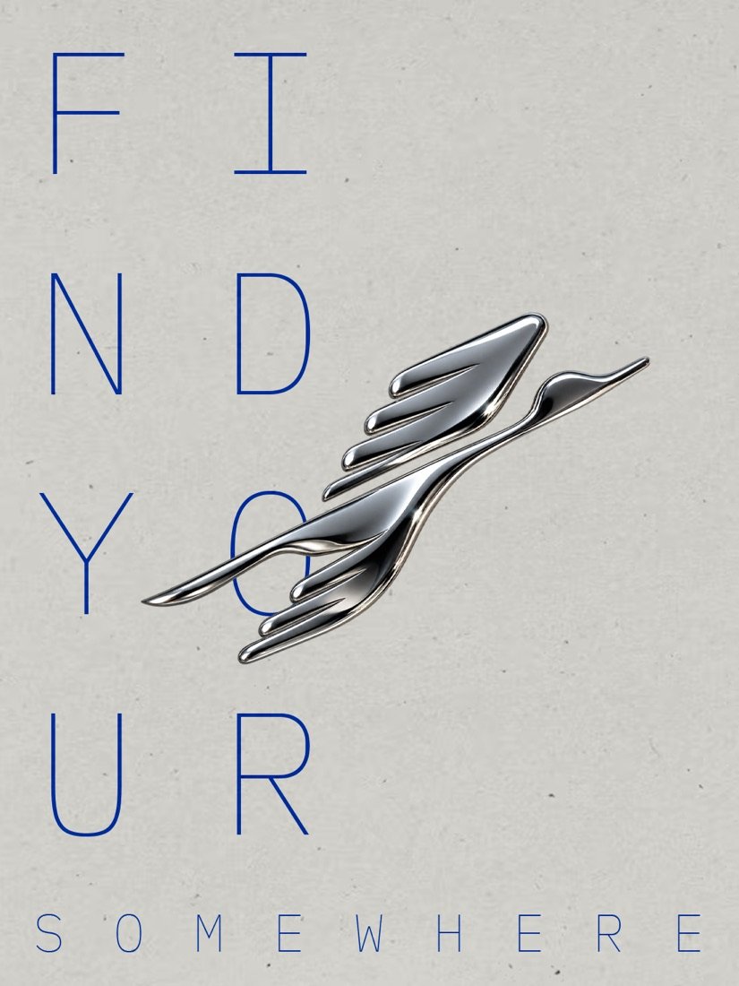
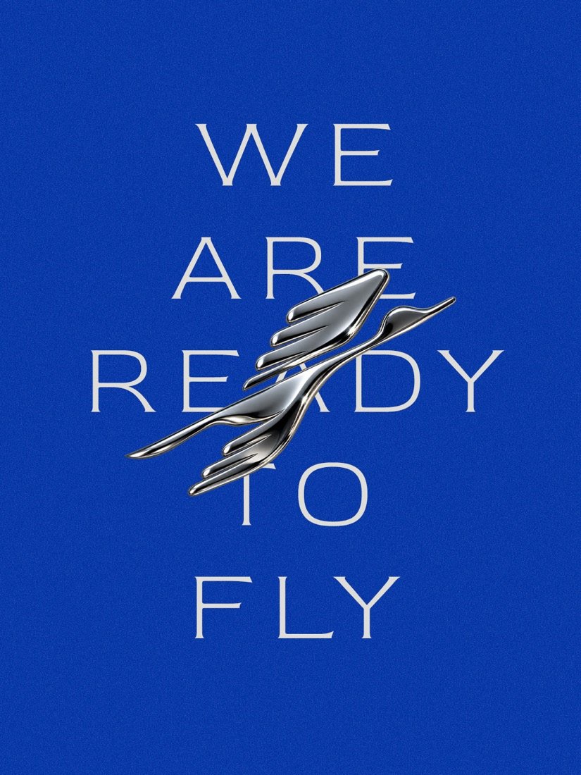
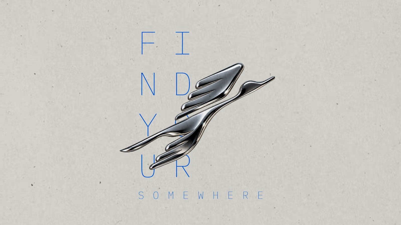
Lines like We are ready to fly and Find your somewhere came straight out of the same idea. The posters stay quiet: one strong colour, plenty of space and the bird doing the talking. In some pieces it turns chrome and sits over the type. In print it is blind-embossed, so you feel it before you see it.
What I took away
The obvious choice was right there. A plane or a pin would have been quicker, safer and easy to approve. But it would not have said anything about Forge Destinations that it could not say about a hundred other travel companies.
Most of the time on a project like this goes into finding the idea, not drawing it. Once the idea is right, the drawing gets simpler, not harder.
Next project
Arab Line Tours