Ocean Crest FC
Where it started
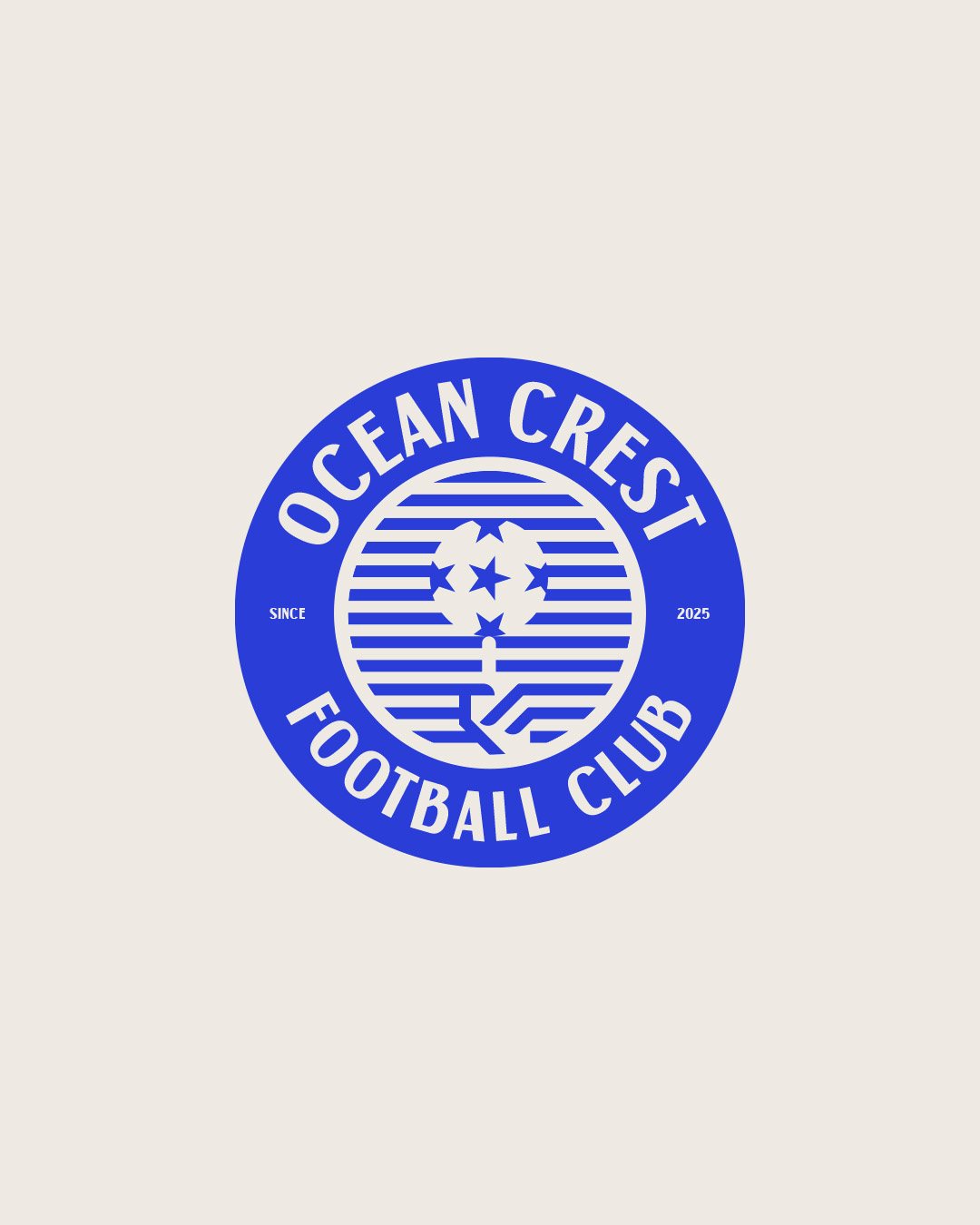
Ocean Crest is a local football club, founded in 2025. They needed a crest: the one mark players wear on their chest and fans wave in the stands.
A football crest has a different job from most logos. It is not there to sell anything. It is there to make people feel they belong to something.
A ball on a fingertip
The idea came from a simple moment every footballer knows: spinning the ball on one finger.
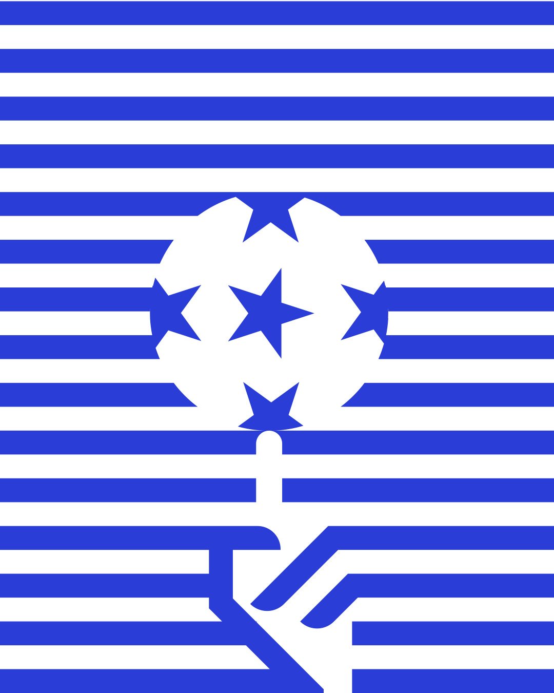
It looks easy, but it takes control, balance and skill. Those are the same qualities a team needs on the pitch. So the symbol shows a football resting on a single fingertip, with the hand drawn in a few clean lines below it.
The panels of the ball are drawn as stars, which gives the crest a sense of ambition. It is a small club with big goals.
Why blue
Blue is the primary colour, chosen to stand for strength, trust and unity. These are the core values of the team, and of the game itself.
The symbol sits on bold horizontal stripes inside a circle, with the club name wrapped around it. The stripes give the crest a calm, steady rhythm that suits the name Ocean Crest, and they work just as well across a full kit.
Control, balance and skill. In one gesture.
From crest to kit
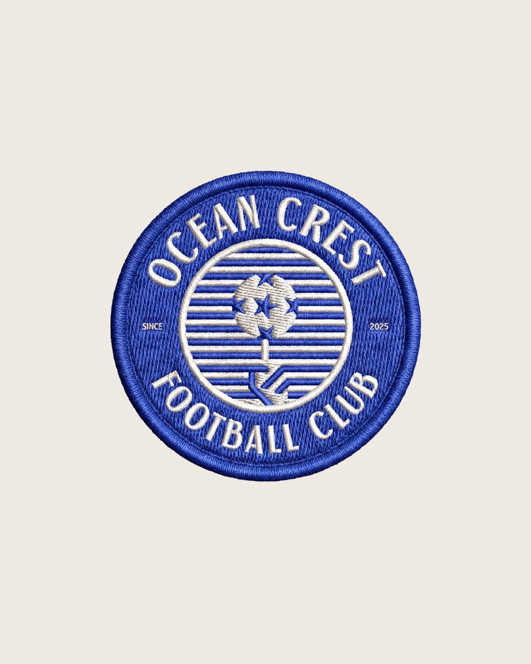
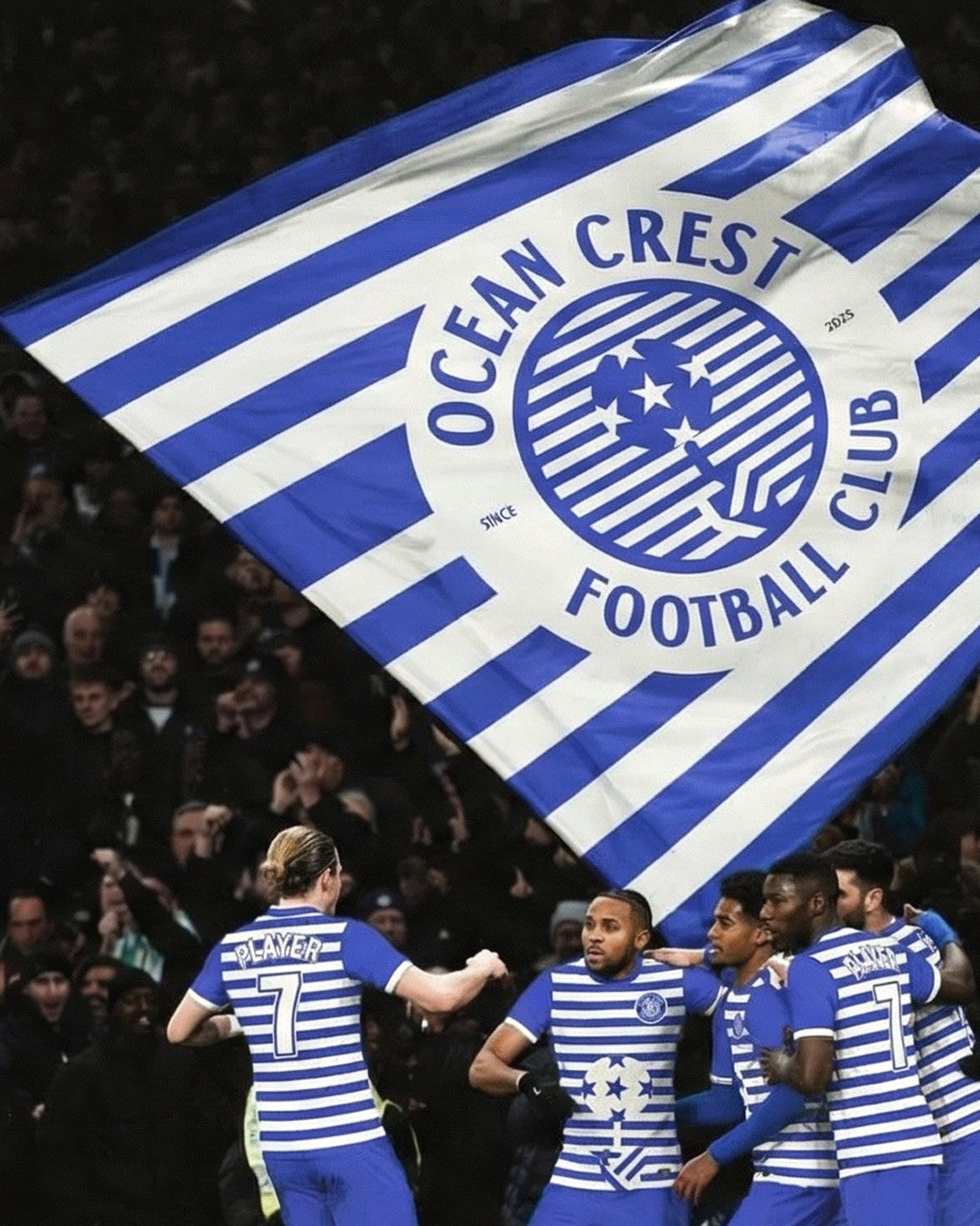
Because the crest is built from simple stripes and shapes, it scales from an embroidered badge to a giant flag in the stands.
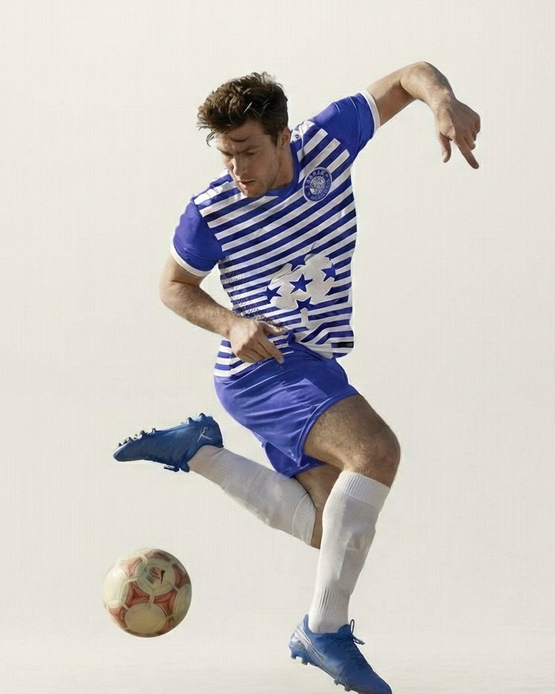
The stripes carry straight onto the shirt, and the ball-on-a-finger symbol becomes a bold graphic across the front. On match day, the whole identity is wearable.
What I took away
The best symbols often come from a gesture people already know. Every footballer has tried to spin the ball on a finger. That is why the crest feels familiar, even the first time you see it.
Next project
Urban Clean Co.