Principle Institution
A logo was not the problem
Perception was.
When Principle Institution came to us, we did not jump straight into design. The first question we asked was simple: why is the current identity not giving this institution the trust it deserves?
An education brand lives on trust. Students and parents are making a big decision, and the first thing they judge is how serious the place looks.
What the old logo got right
It turned out the old logo already had a shield. That made sense. A shield says education, protection and credibility. So the idea was never wrong.
The execution was. It looked generic. The type was not clean. Nothing about it said this institution is serious about where it is headed.
Keep the shield, rebuild the rest
So we did not throw it out. The shield was the one thing worth keeping, and we rebuilt everything around it.
We set it inside a circle, for a sense of unity and a global outlook. The shield stays front and centre. Then we cut wing-like strokes into it, so the mark carries a feeling of growth and ambition, of learners reaching higher.
The result still feels familiar to anyone who knew the old logo. It just looks like it finally means it.
Trust is not something you replace. It is something you sharpen.
A wordmark built from scratch
The type needed more than a cleanup, so we drew a new wordmark from the ground up.
The letterforms are custom, built on the same geometry as the icon. They are cleaner and easier to read, and they finally look like they belong to a serious institution rather than a template.
A system to grow into
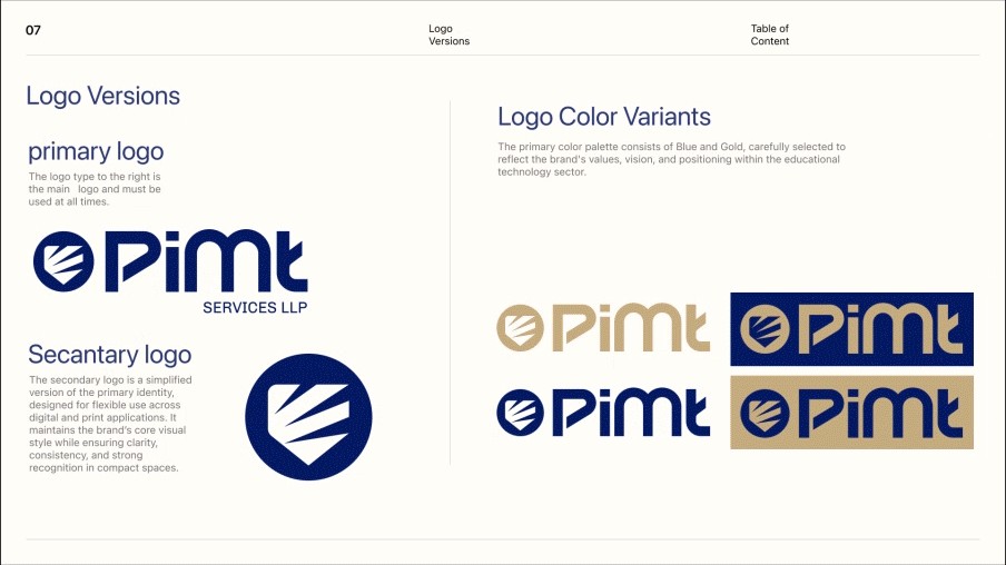
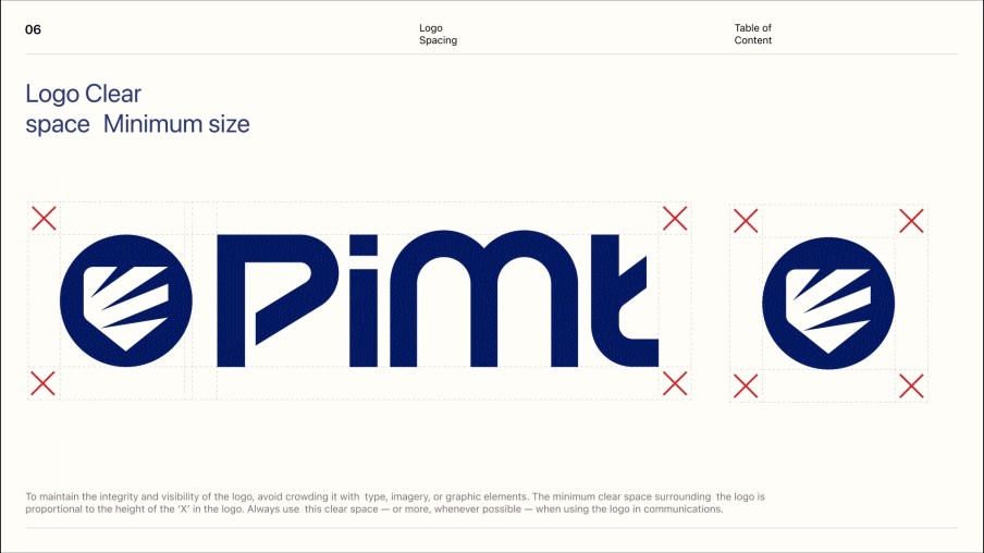
Around the logo we built a full identity system. There is a primary logo, a compact icon for small spaces, and clear rules for spacing and minimum size so the mark is never crowded.
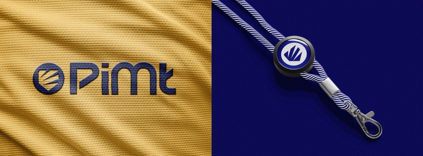
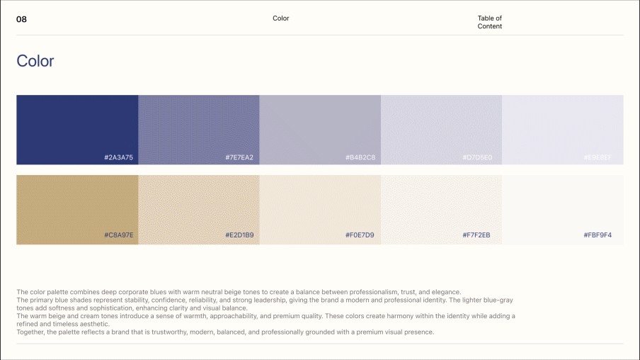
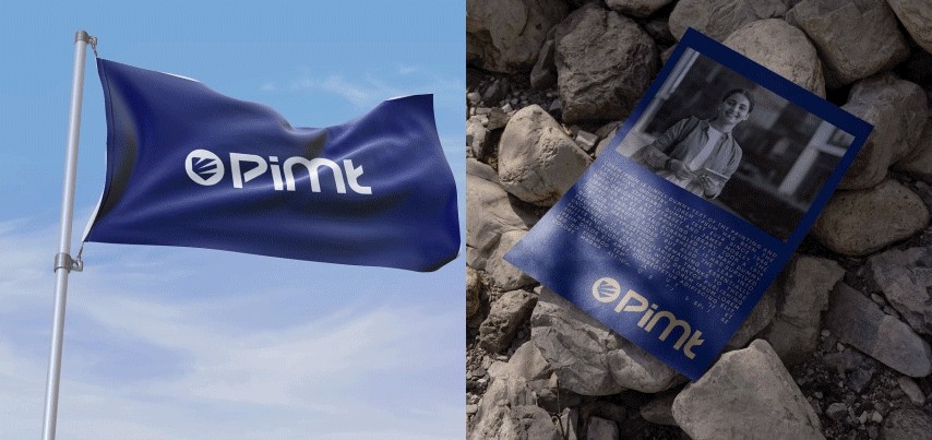
The palette pairs deep corporate blue with warm gold and beige. The blue brings stability and confidence. The warm tones add approachability and a premium finish. Together they show up on uniforms, lanyards, flags and print, and the institution looks like one place everywhere.
What we took away
Rebranding was never really about the logo looking nicer. It was about people trusting the place more.
When a brand has real history, it is worth asking what to keep before deciding what to change. Here the shield already had the right idea. Our job was to keep what Principle Institution had going for it and give it room to grow into what comes next.
Next project
Abu Ansab