The Design Vault
Where it started
The team at The Design Vault came to me with three words: security, innovation and timelessness. They wanted a brand that felt reliable and creative at the same time.
That is a tricky balance. Lean on security and a brand can feel heavy and cold. Lean on creativity and it can feel loose. The answer was already in the name. A vault keeps valuable things safe. For a design studio, the valuable thing is the work.
Looking at vaults
I started with research: vault architecture, security symbols and where modern identity design is heading.
Vault doors have a strong, solid geometry. Thick rounded frames, heavy lines, a clear centre. That gave me the structure. The keyhole gave me the idea. A keyhole is how you get in, and good design is often about unlocking something: a problem, a message, a new direction.
Keeping it simple
In sketching, the risk was clutter. Vaults come with dials, bolts, hinges and handles. I left almost all of it out.
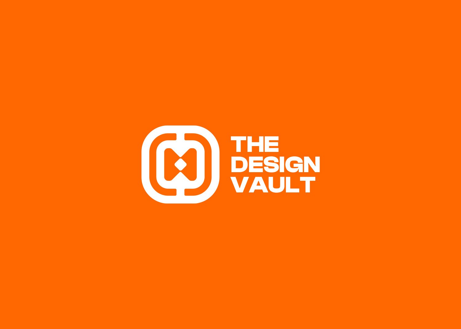
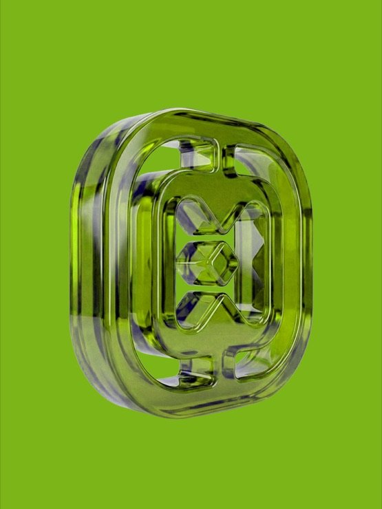
The final icon is a rounded vault frame, with two mirrored forms inside that meet at a small keyhole in the centre. Sharp lines inside soft corners: strength on the outside, an idea in the middle. The mark repeats the vault shape layer by layer, which is what gives it that sense of protection.
“The logo perfectly captures our ethos: strong yet innovative. It has become a cornerstone of our identity.”
The Design Vault team
A flexible system
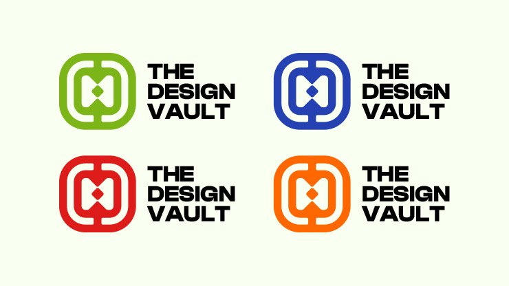
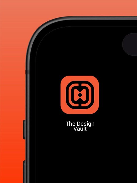
The logo works in a single colour, which keeps it strong at any size. From there it moves through a bold palette of orange, green, blue and red, so the studio can stay consistent and still feel fresh.
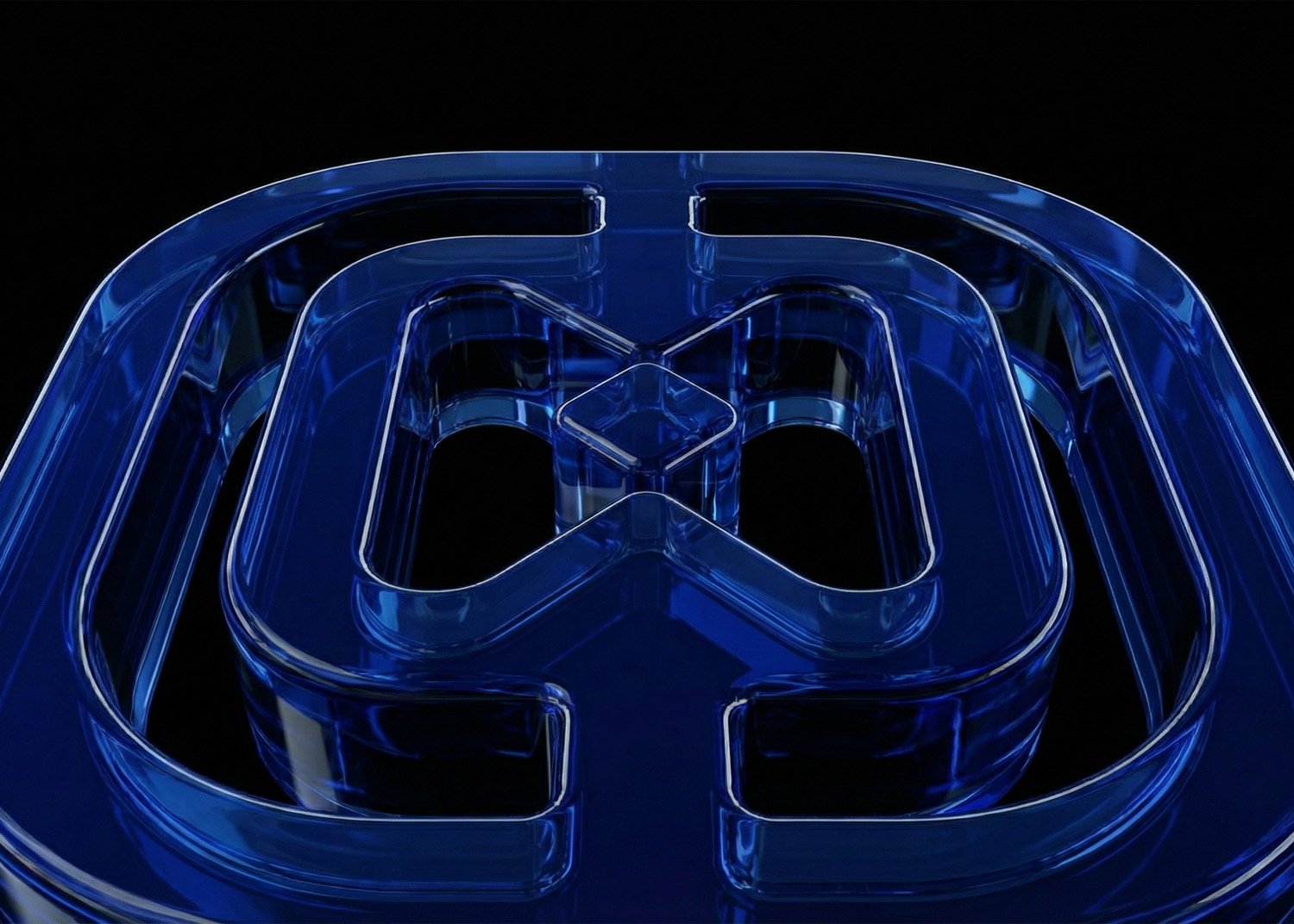
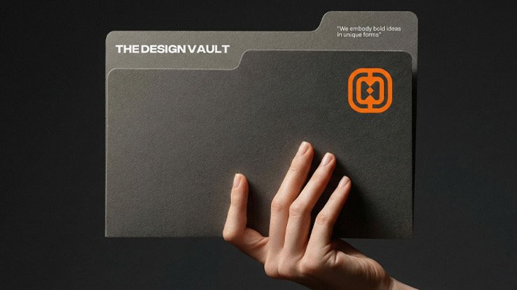
It sits easily on a phone screen as an app icon, prints cleanly on stationery, and even becomes a glass object in 3D.
Why it works
It is memorable. The vault shape is subtle enough to make people look twice.
It scales. Single-colour versions keep their impact from a favicon to a wall.
It tells the story. Every part, the frame, the mirrored forms and the keyhole, connects back to the studio's mission of protecting and unlocking good design.
Next project
Arab Line Tours