Urban Clean Co.
Where it started
Urban Clean Co. is a modern cleaning company. They wanted an identity that felt bold and current, and still came across as reliable and professional. Cleaning is a trust business. People are letting you into their homes and offices.
Most cleaning brands reach for the same things: sparkles, bubbles, a spray bottle. I wanted Urban Clean Co. to look smarter than that.
Why a crow
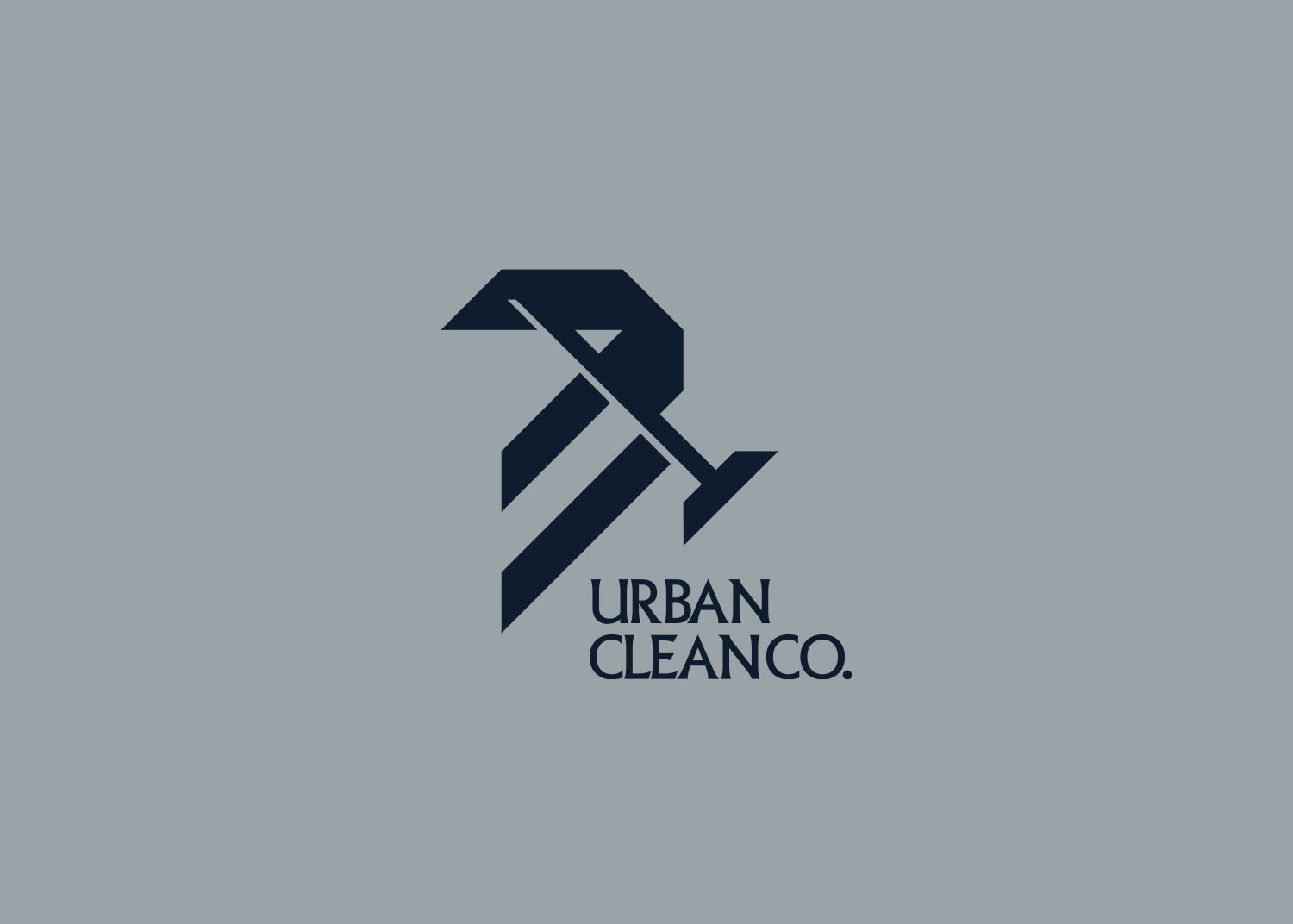
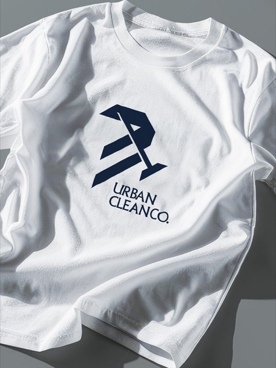
The main idea of the logo is a crow holding a broom.
I chose the crow because it stands for intelligence, alertness and adaptability. Crows are known for being clever and very aware of their surroundings. They notice everything.
That connects well with a cleaning brand that is all about efficiency and attention to detail. A good cleaner, like a crow, sees what everyone else misses.
The broom says the rest
The crow brings the personality. The broom brings the clarity. It tells people what the company does, straight away, with no explanation needed.
The two are drawn as one mark with sharp, angular shapes. The bristles of the broom become bold diagonal strokes under the bird, so the mark feels like it is moving, sweeping forward.
A good cleaner, like a crow, sees what everyone else misses.
Modern and bold
The palette stays deliberately calm: deep navy and slate grey. It feels dependable and professional, and it lets the sharp shape of the crow stand out.
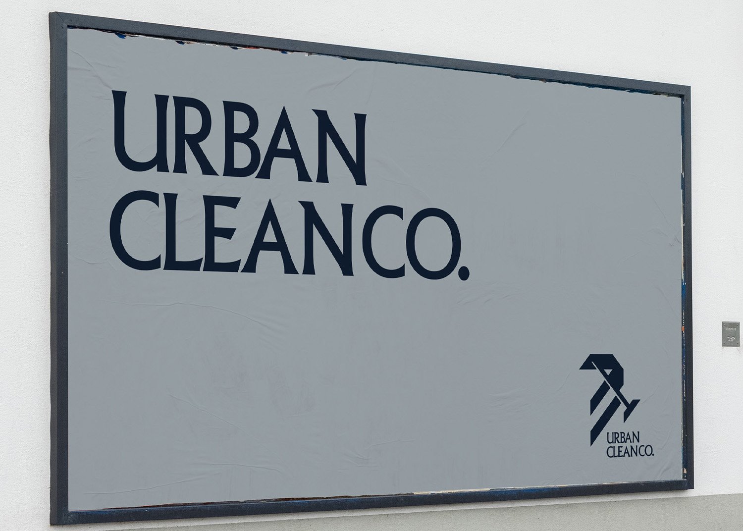
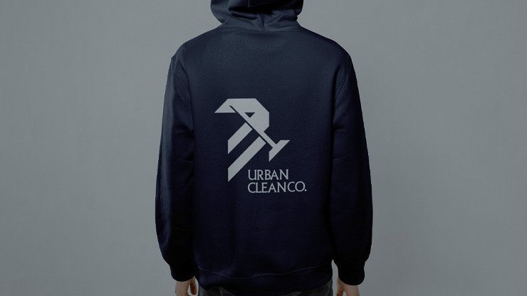
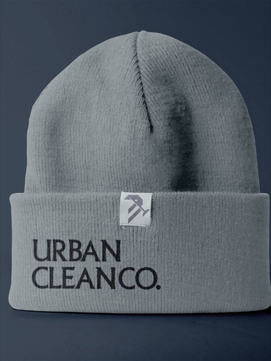
The wordmark is set in a refined serif, which softens the angular mark and adds a touch of class. Together they work on billboards, uniforms and merchandise, where a cleaning team is seen every day.
What I took away
A logo can carry a personality and a service at the same time. Here the crow says how the company works, and the broom says what it does.
When those two ideas share one shape, the brand becomes easy to remember and hard to confuse with anyone else.
Next project
The Design Vault