Arab Line Tours
Where it started
Arab Line Tours is a travel and tourism company based in the UAE. Their mission is simple: connect travellers with journeys that feel easy from start to finish.
They needed a logo that did two jobs at once. It had to feel rooted in the UAE, and it had to speak the universal language of travel. Lean too far one way and it becomes a local souvenir. Lean too far the other and it looks like every travel agency in the world.
Two symbols, one mark
I started with the two ideas that mattered most.
The location pin is the clearest symbol of travel there is. It means navigation, destinations and a world that is connected.
The date palm is a symbol of the UAE itself: heritage, resilience and growth. People here see it every day, and they recognise it instantly.
The palm inside the pin
Instead of placing the two side by side, I let one live inside the other. The palm appears in the negative space of the pin, cut out of the shape rather than drawn on top of it.
At first glance it is a simple travel pin. Look again and the palm tree appears. That small moment of discovery is what makes people remember it.
It also says something true about the company. Arab Line Tours brings tradition and modern travel together, the same way the palm and the pin share one shape.
A travel pin at first glance. A palm tree on the second.
Colour and language
The palette is built on a strong, clear blue. It brings trust and professionalism, and it echoes the sky and the sea, which suits a travel brand perfectly.
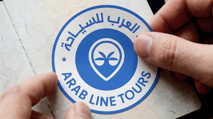
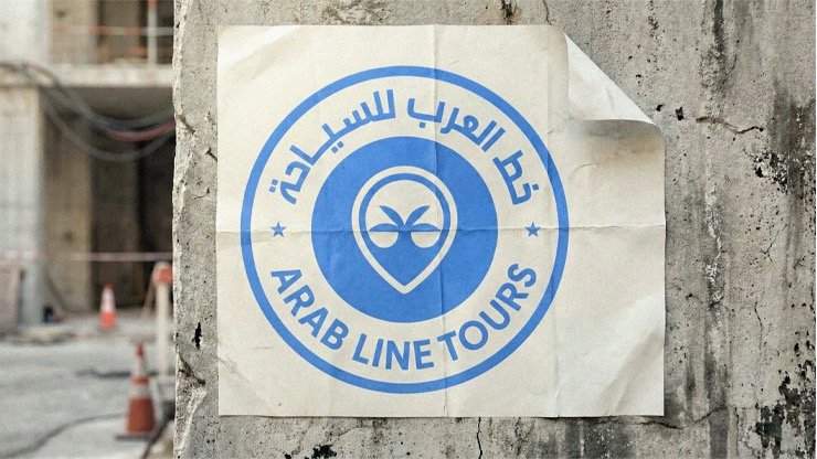
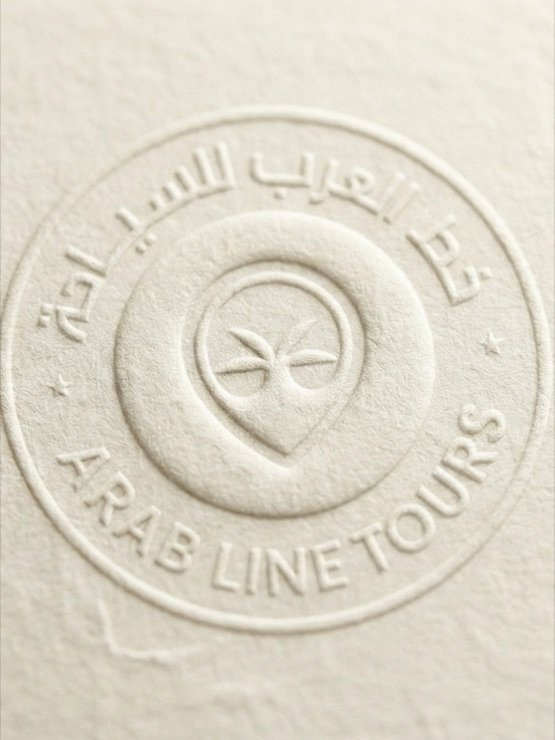
The name is set in both Arabic and English as one lockup. The same mark also works as a round badge, like a stamp in a passport, with both names wrapped around the pin.
Why it works
It is memorable. The hidden palm creates a small surprise, and surprises stick.
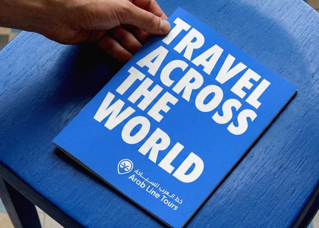
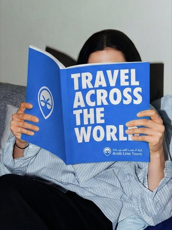
It is versatile. The mark holds up on screens, in print and on merchandise. It works as a sticker, a brochure cover or a blind emboss on paper.
It connects with both audiences. People in the UAE recognise the palm immediately. International travellers see a clean, modern travel brand. Both are right.
Next project
BEC