Elevate Mastermind Academy

Where it started
Elevate Mastermind Academy is a learning brand built around one promise: helping people grow into the best version of their professional selves.
Some projects take a few rounds before everyone is on the same page. This was not one of them. From our very first conversation, the founder shared her vision with real clarity. She knew who the academy was for, how it should feel, and where she wanted it to go.
That kind of clarity makes a designer's job a lot easier. It also made the whole process genuinely enjoyable.
Doing the homework
Before sketching, I spent time on research. I looked at how academies and coaching brands present themselves, and at what makes a learning brand feel credible rather than just motivational.
Two words kept coming back from the brief: elevate and mastery. People join an academy like this to move up. They also need to trust it before they hand over their time and money. The mark had to carry both ideas.
Three ideas, one mark
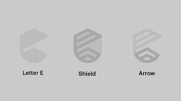
The final icon is built from three simple shapes layered into one.
The letter E gives the brand its initial, so the mark belongs to Elevate and no one else. The outline of a shield wraps around it, for trust, credibility and the sense that this is a safe place to invest in yourself. At the base, an arrow points upward, which is exactly what the name promises.
The lines are drawn as clean, parallel strokes. They keep the mark light and modern, and they read clearly whether it is on a poster or a tiny profile picture.
The very first concept I shared was the one she loved and approved.
One round, approved
I explored a few directions, but I chose to lead with this one. Interestingly, it was the first concept she saw, and it was the one she chose.
That does not happen often. When it does, it usually means the brief was strong and the research did its job. The design simply gave shape to an idea she already had.
Bringing it to life
From the mark, we built an identity system with a bold black and white base and a confident line for the campaign: Where mastery meets opportunity.
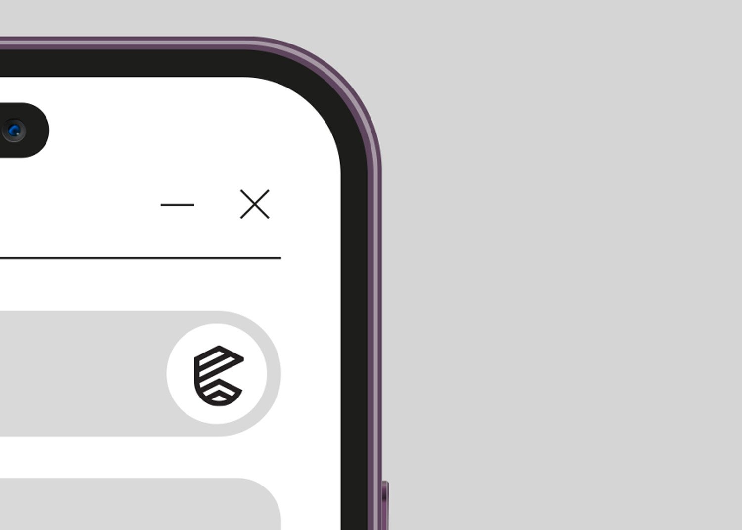
It runs across posters, digital screens and social profiles. The icon works on its own as an app avatar, and the full lockup carries the name wherever there is more room.


What I took away
A clear brief is a gift. When a client knows what they stand for, the designer can spend their energy on the idea instead of guessing.
Research still matters, even when the vision is clear. It is what turns a good brief into a mark that feels inevitable.
Next project
Principle Institution