Elya
Where it started
Elya is an agritech company working to change how farming is done in Kerala. They bring new technology to local growers, with a strong focus on sustainability.
The brand had to hold two ideas at once. It needed to feel modern enough for a technology company, and still feel close to the soil, the farmer and the food.

The idea
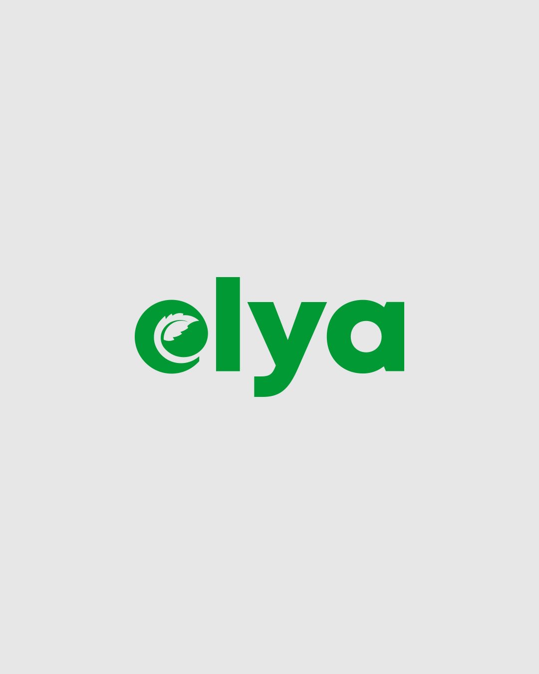
I built the identity around the first letter of the name. The e is drawn as a bold, rounded monogram, and inside its curve sits a leaf, growing out of the letter itself.
The leaf says agriculture and natural growth without needing a tractor, a field or a sunrise. The round, closed shape of the e feels protective, like something being looked after. That is the whole promise of the brand: nurturing and progress in one simple mark.
The wordmark next to it is set in a heavy geometric sans, so the name feels confident and current, while the monogram carries the warmth.

A good mark should feel simple the first time you see it and still have something to find the tenth time.
Built to travel
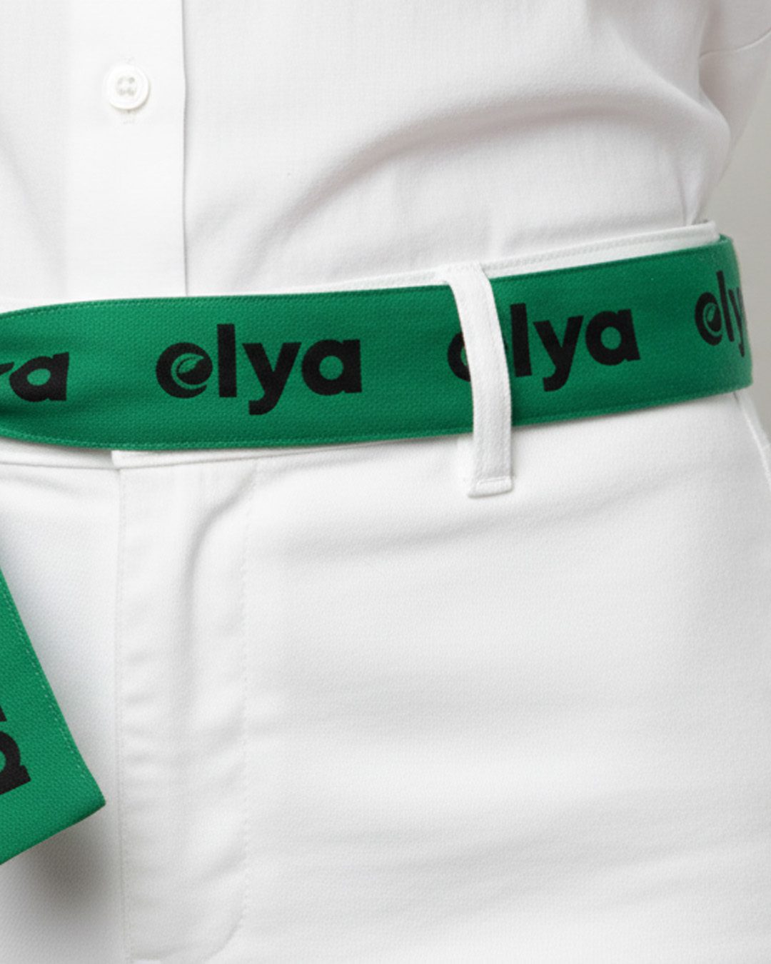
The monogram is built on circles, so it stays balanced and clean at any size. That mattered, because Elya's brand has to live in very different places: an app icon, a field uniform, a business card and a pack of fresh greens.
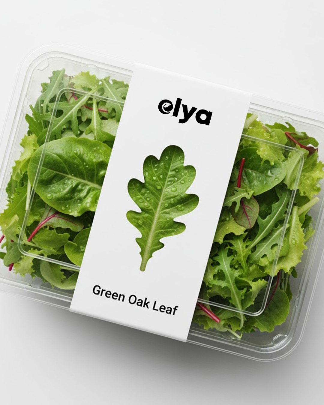
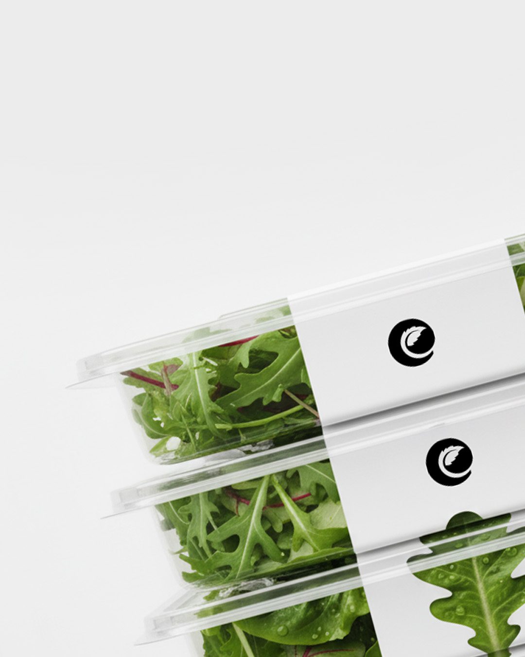
On produce packaging the system stays quiet. A white sleeve, the logo, a single leaf and the product name. The greens inside do most of the talking, and the brand just signs its name.
What I took away
Agritech brands often lean too far one way. Either they look like a software company that forgot about farming, or a farm that forgot it is a tech company.
Putting the leaf inside the letter was my way of holding both. Simple, memorable and flexible enough to grow with Elya.
Next project
Mr. SEO