Mr. SEO

Where it started
Mr. SEO is a digital marketing firm based in the UAE. They handle SEO, paid ads, social media, content and websites for their clients.
When they asked me for a brand identity, they already knew one thing: they wanted a mascot logo.
The ideas that did not land
I sent them several mascot directions. None of them clicked. That happens, and it usually means the brief is pointing at the wrong thing.
After a few rounds they came back with a different message: do whatever you want. Full creative freedom. That is exciting, but it is also a lot of pressure, because now there is nothing to hide behind.
Finding the idea in the name
So I stopped trying to draw a character and went back to the name. Mr. SEO already sounds like a person. Someone a little mysterious, who knows how to find things.
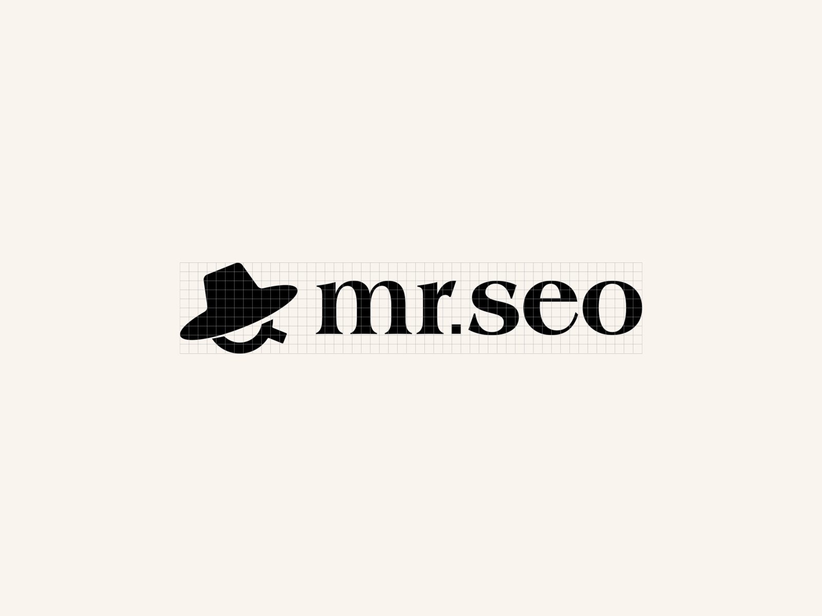
That gave me two pieces. Mr. became a stylish hat, the kind a gentleman or a detective would wear. SEO became a magnifying glass, the simplest symbol for searching and discovery.
Put them together and you get a face that is only half there: a hat, and a lens peeking out from under the brim. It still feels like a mascot, which is what they asked for in the first place, but it is built from the name instead of added on top of it.
Next to it I set the name in a sharp serif. The hat brings the character, and the type keeps the whole thing grown up enough for a business that sells results.
Sometimes the best brief is no brief at all. Freedom gave me room to find the idea inside the name.
How it came out
When I sent the final design, the client loved it at first glance. No rounds of changes, no second guessing.
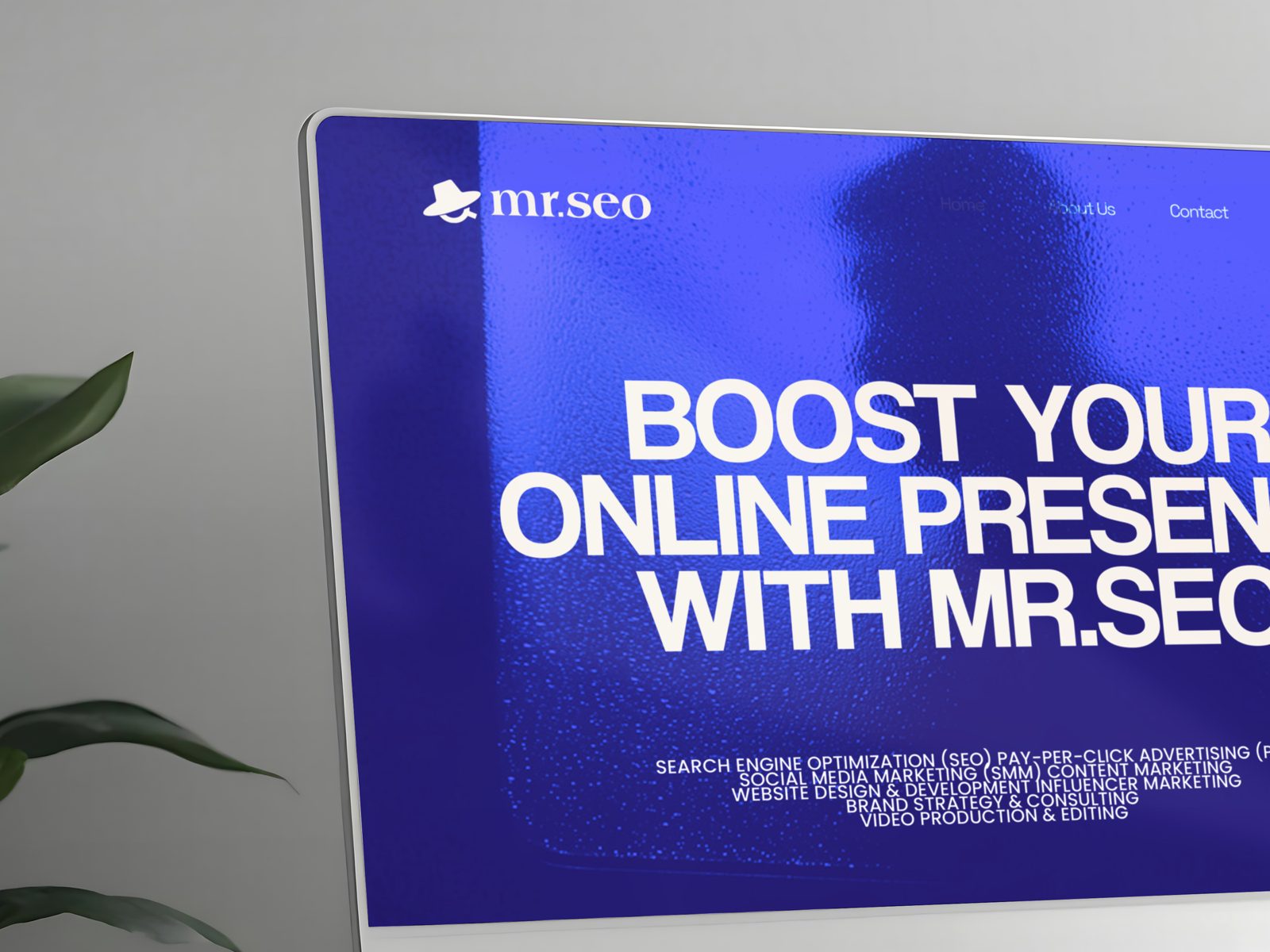
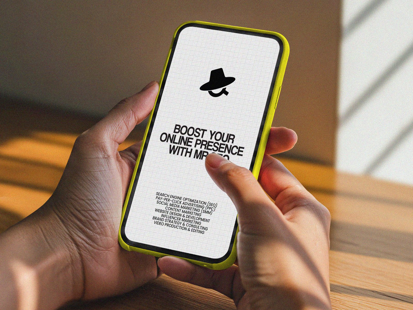
The mark is simple enough to work as an app icon or a small profile picture, and it has enough personality to carry a full website hero on its own. On a deep blue background it feels confident. On cream it feels clean and editorial.
What I took away
The client was right that they needed a character. They were just looking for it in the wrong place. The character was already in their name.
It was a good reminder that when an idea keeps getting rejected, the answer is usually not more of the same. It is to step back and ask a different question.
Next project
Povam