Essensiaura
Where it started
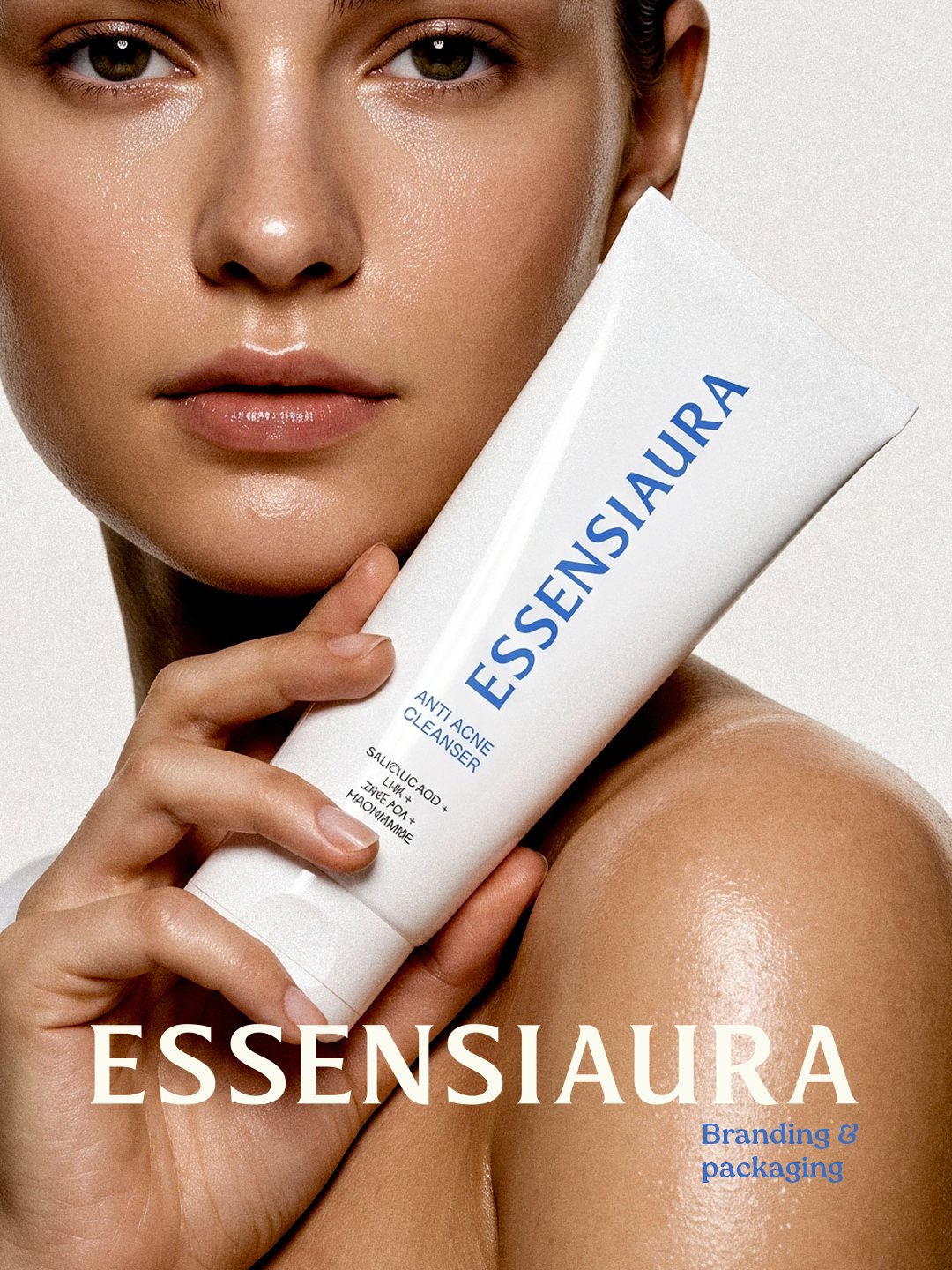
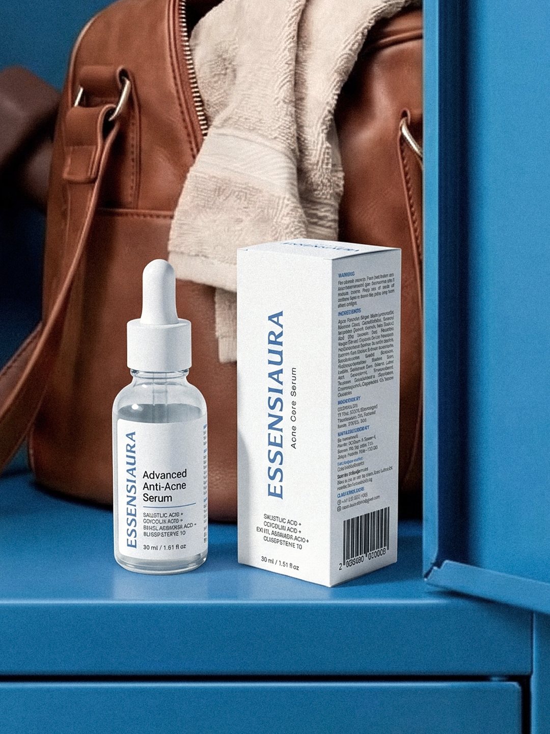
Essensiaura is a skincare brand from Palakkad, Kerala. Their first range was for acne: a serum and a face cleanser built on salicylic acid, glycolic acid, ethyl ascorbic acid and oligopeptide-10.
The formulas were ready. What they needed was packaging that looked as serious as what was inside, and that made people trust it before they had even tried it.
Thinking about the buyer
I started with the person picking it up. Someone with acne has usually tried a few products already. Some did nothing, some made it worse. So they are careful. They turn the box over, read the ingredients and look for a reason not to trust it.
That told me what the pack should not do. It should not shout, promise miracles or look like a cosmetic. It had to feel calm, clean and honest, closer to a pharmacy shelf than a makeup counter.
One colour, used everywhere
I kept the base white and gave the brand a single blue. Blue reads as clean and dependable, and on a white pack it looks clinical without feeling cold.
The rule was simple: one blue, and nothing else competing with it. The same shade runs across the serum label, the cleanser tube and the carton, so the range looks like a family even when the products sit apart.
The wordmark runs vertically up the front of every pack. On a shelf it is the first thing you see, and it gives the bottle, tube and box the same face. The product name and actives sit underneath in a quieter typeface, so you can read what it is in a couple of seconds.
In skincare, people decide whether to trust a product long before they use it. The pack is where that decision happens.
Every panel has a job
A carton has six sides, and most brands fill them with whatever fits. I planned each panel around one question a buyer might have.
The front answers what is it: the brand, the product and the four actives. One side answers what does it do, with the benefits and hero ingredients in plain words. The other side covers is it safe, with the full ingredient list, warnings and how to use it. The back tells the brand story and ends on the line Confidence in Every Drop.
Someone who wants to read everything can find it. Someone who only glances still knows what they are holding.
What I took away
It is tempting to make a launch pack loud. More colour, bigger claims, a few badges. For acne care that would have worked against the brand, because the buyer is already doubtful.
Keeping it quiet was the harder choice, but it is the one that builds trust. And because the system is just one blue, one wordmark and a clear panel layout, Essensiaura can add new products to the range without starting from zero.
Next project
Principle Institution