Povam
Where it started
Povam is a travel and camping brand. When we first sat down with the client, the brief was one line: we need something unique.
They did not want another camping brand with a borrowed English name and a mountain in the logo. They wanted something people would actually feel connected to.
Finding the name
Most of their customers were going to be Malayalis. That changed everything. Malayalis respond to their own language in a way they never will to a polished global name. A word from home carries mood, memory and humour all at once.
So instead of inventing something that sounded international, I looked for a word people already say. After a lot of lists and rejected ideas, I landed on Povam, the casual Malayalam way of saying let's go.
It is what friends say when the plan is finally on. Someone has a car, someone knows a spot in Wayanad, and someone says povam. The client got it immediately. It was not just a name, it was the feeling right before a trip.
Building the wordmark
Camping brands tend to look the same. Mountains, pine trees, a tent, all inside a round badge. I wanted Povam to stay away from all of that.
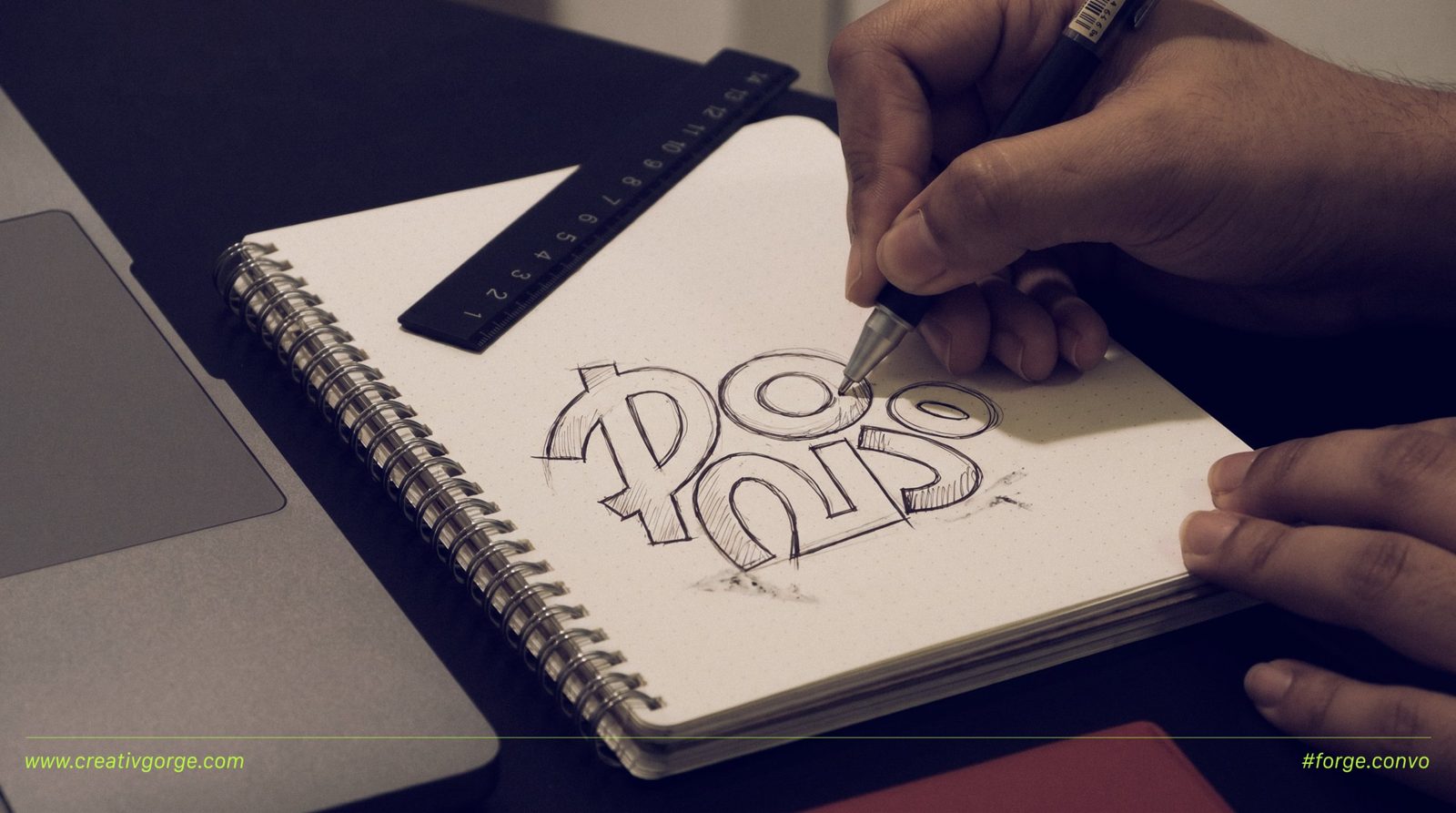
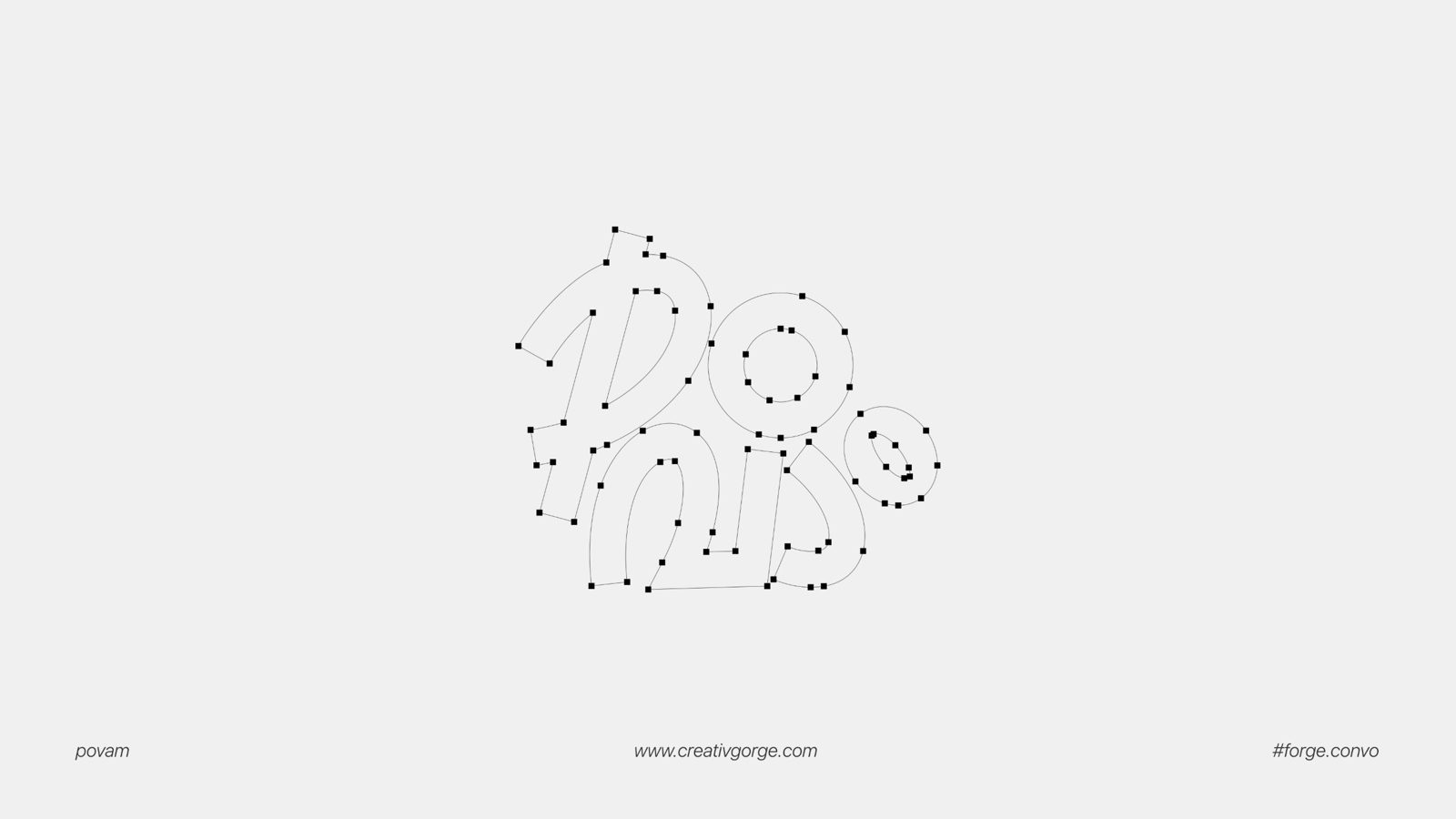
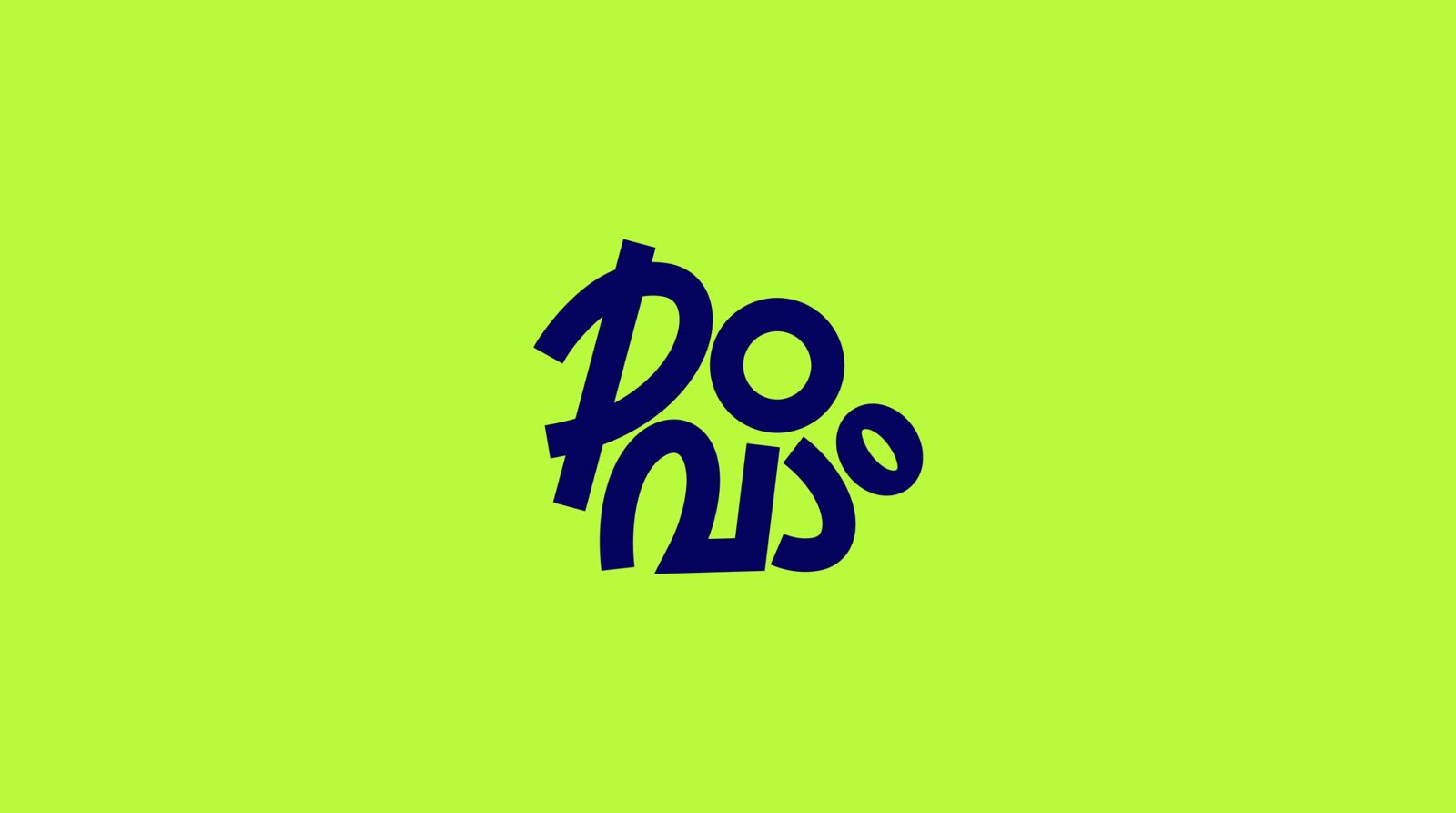
Since the name was the idea, the type had to carry it. I drew a wordmark that sits between two scripts. Read it one way and you see the Malayalam പോവാം. Look again and the English letters start to show through. Malayalis read it in their own language, and everyone else still gets a strong, playful shape.
The letters lean and bounce instead of sitting on a straight line. It looks a little restless, like it is already on the move. That was the point. Everything started as pen sketches before going to vector, so the curves keep some of that hand-drawn energy.
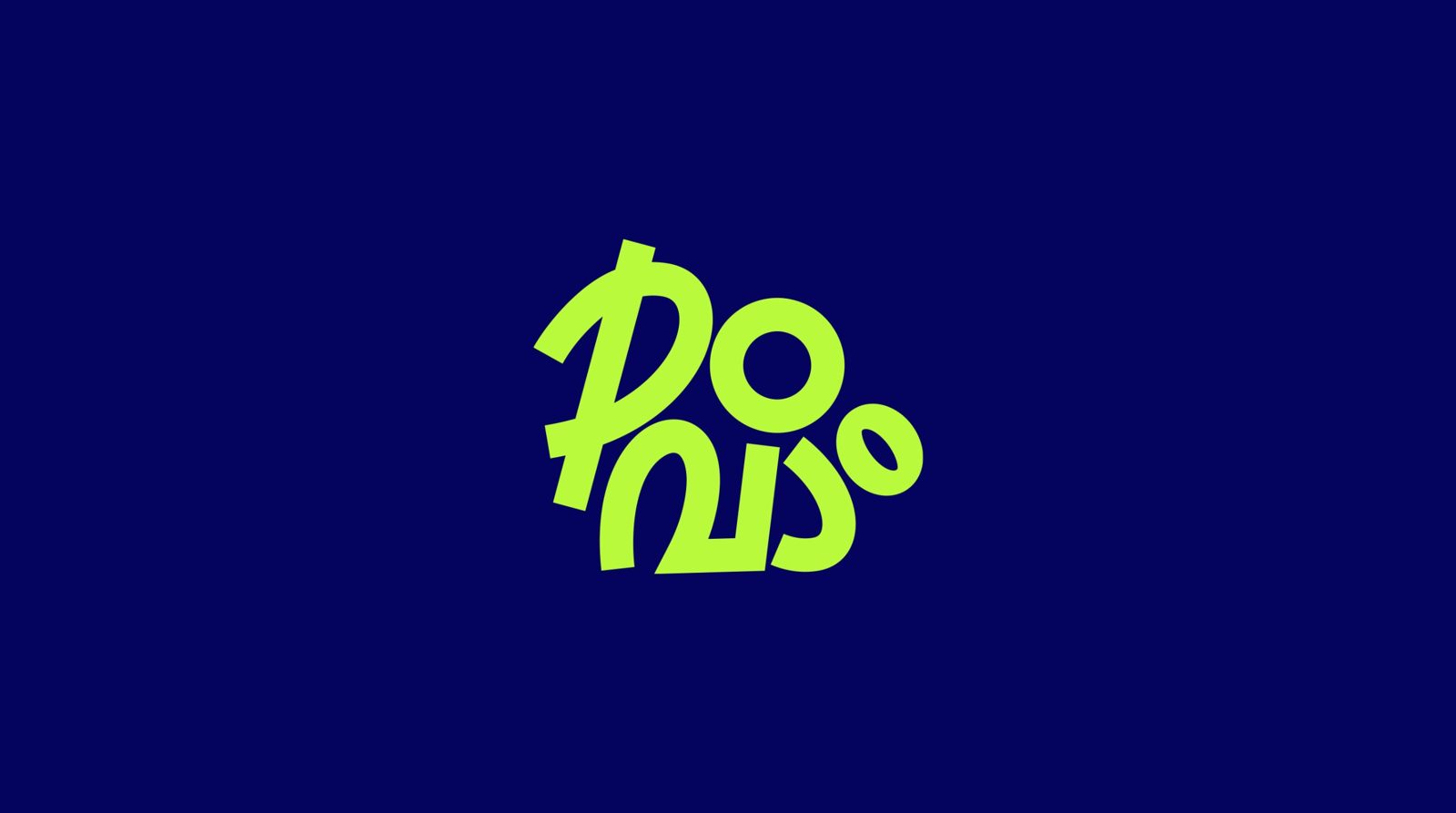
Sometimes the most distinctive name is a word your audience already says every day.
Out in the world
The colours are just two: a loud lime green and a deep navy. The lime stands out against forest, sky and grass, which is exactly where this brand lives. The navy keeps it grounded.
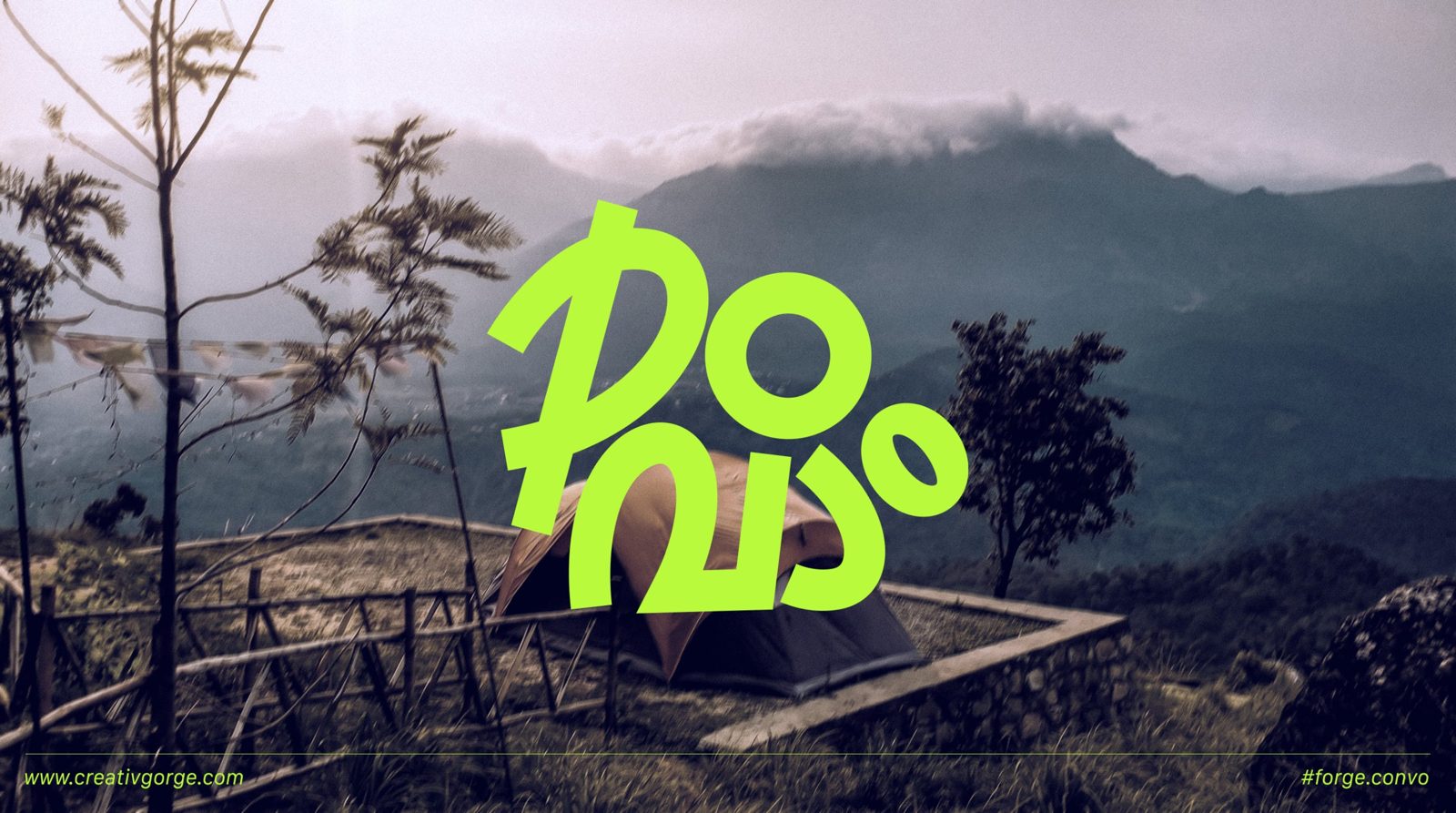
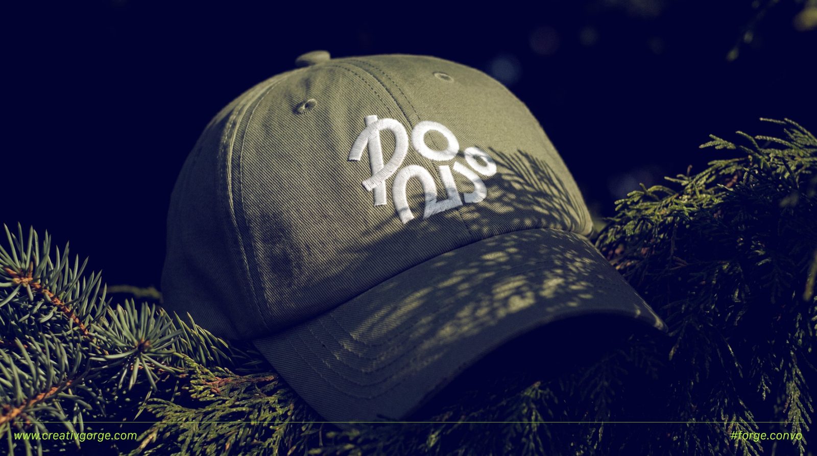
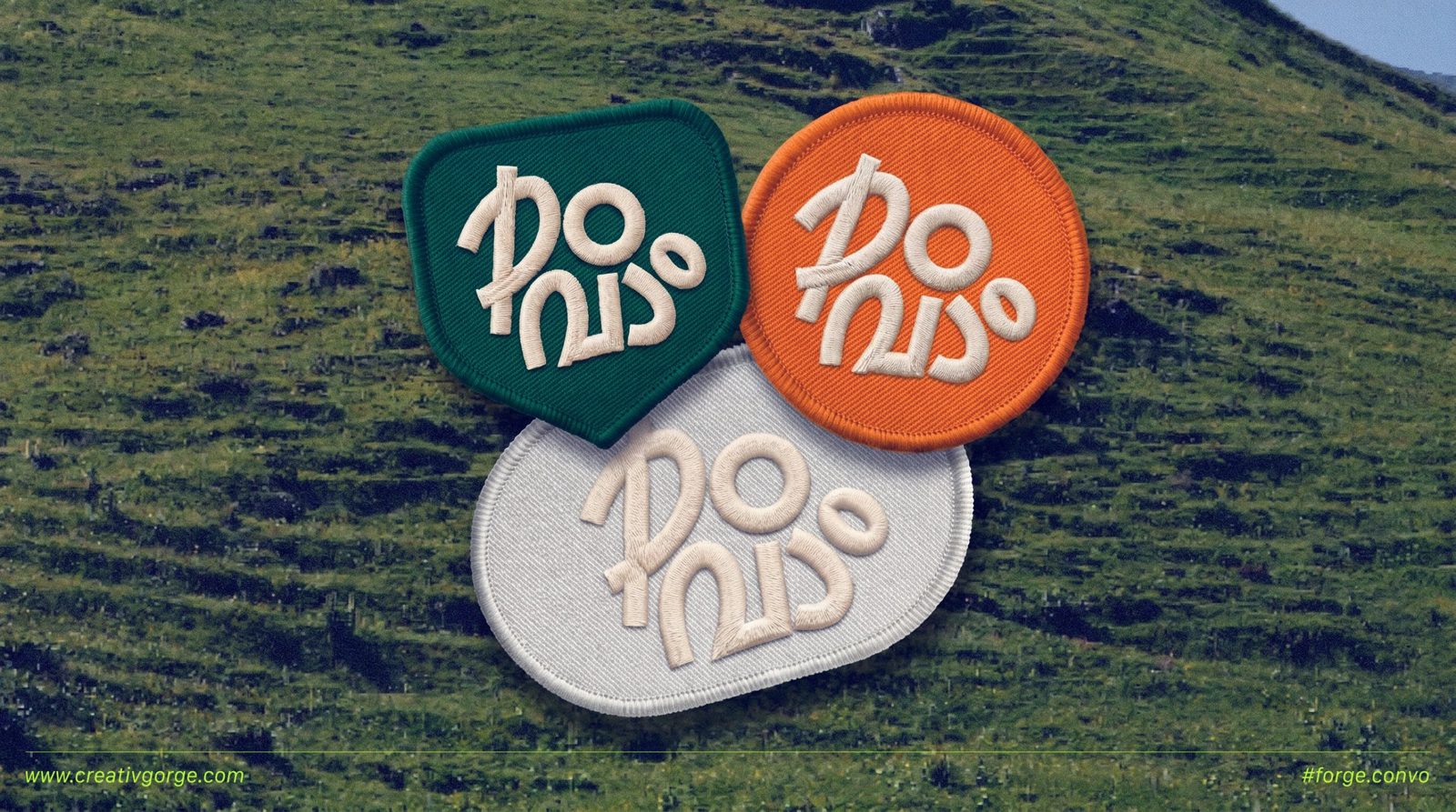
Because the wordmark is the identity, it works on almost anything. It sits on a cap as a simple embroidery, on patches people can stick on their bags, and large over campsite photos without needing a frame or a badge around it.
What I took away
The safe route was an English name and a mountain icon. It would have been easy to approve and easy to forget.
Povam works because it starts from the audience, not from the category. The name feels local, the wordmark is rooted in Malayalam, and together they talk to people the way their friends do. That is hard for a competitor to copy.
Next project
Essensiaura