Panther
Where it started
Panther is a premium menswear brand built entirely around black apparel. When we first spoke, the brief sounded simple: we need a unique icon.
Then I started the research and hit a problem straight away. The name Panther is not unique. A quick look at the market turned up dozens of businesses using it.
And most of them had landed on the same answer: a detailed panther head, or a cat mid-roar. Put them side by side and they blur into one. That was the one direction I knew I did not want to take.
A better question
So I stopped asking how to draw another panther. The question became: how can this brand feel different and still carry the idea of a panther?
The answer came from the client, not from me. In our brand strategy workshop a few things kept coming up. Every collection would be limited, never mass produced. Every release should feel exclusive. A customer should feel like they are owning a trophy, not just buying another T-shirt.
There was also the long view. Panther wants to grow past clothing into footwear, accessories, fragrance and other premium lifestyle products. The icon had to work on a perfume bottle as well as a hoodie.
Dozens of sketches
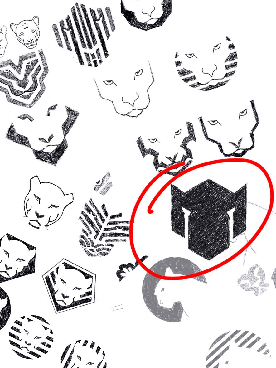
I started on paper. I drew the panther face from every angle I could think of: front on, in profile, broken into stripes, pushed into circles and badges, built out of straight lines.
Most of them were fine. A few were nice. But the realistic ones all felt like they belonged to someone else, and the busy ones fell apart the moment I imagined them small on a label.
The one that stuck was the simplest on the page. A few flat geometric shapes, the ears cut into the top, the eyes made only by the gaps between the forms.
The final mark
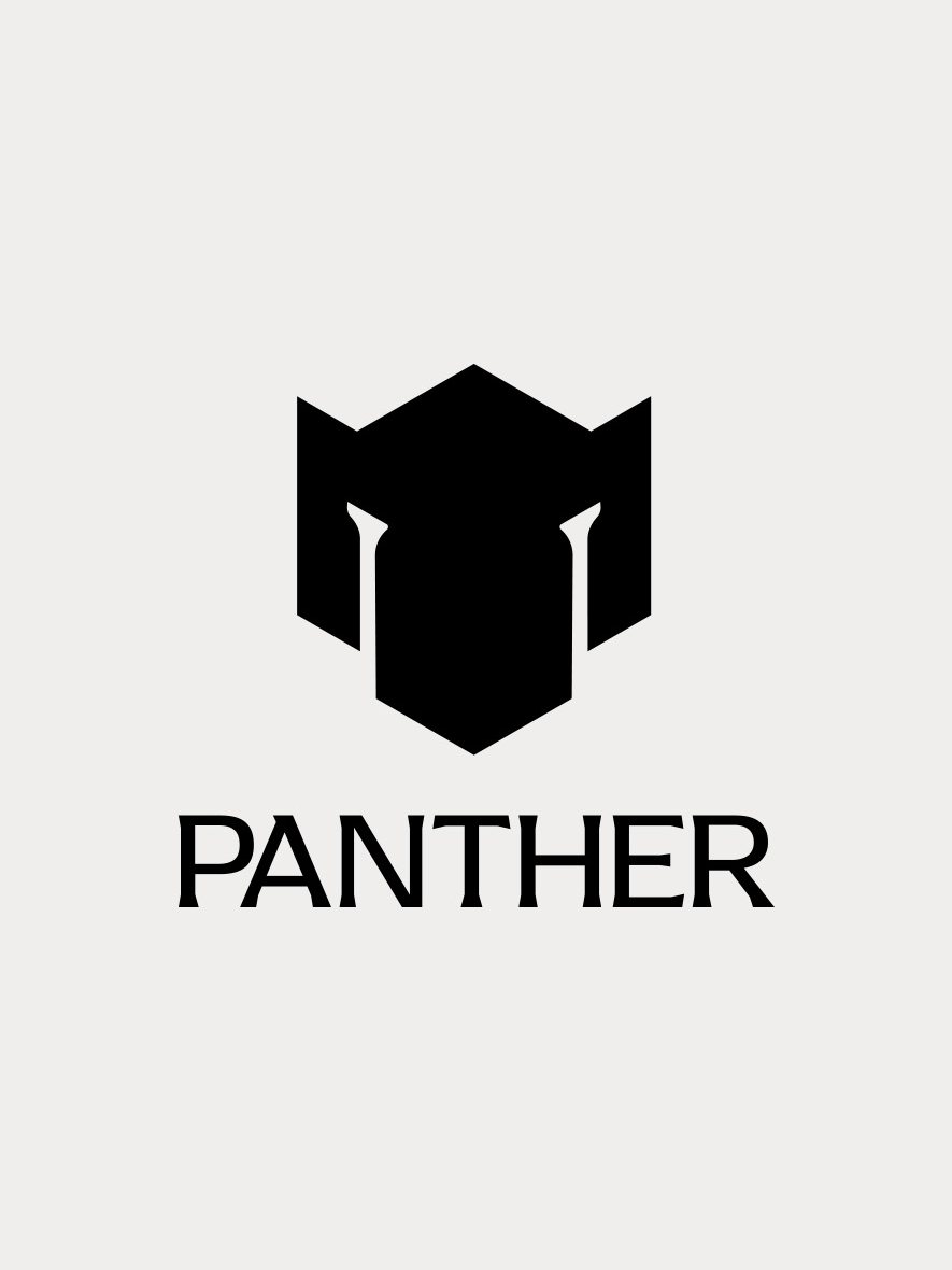
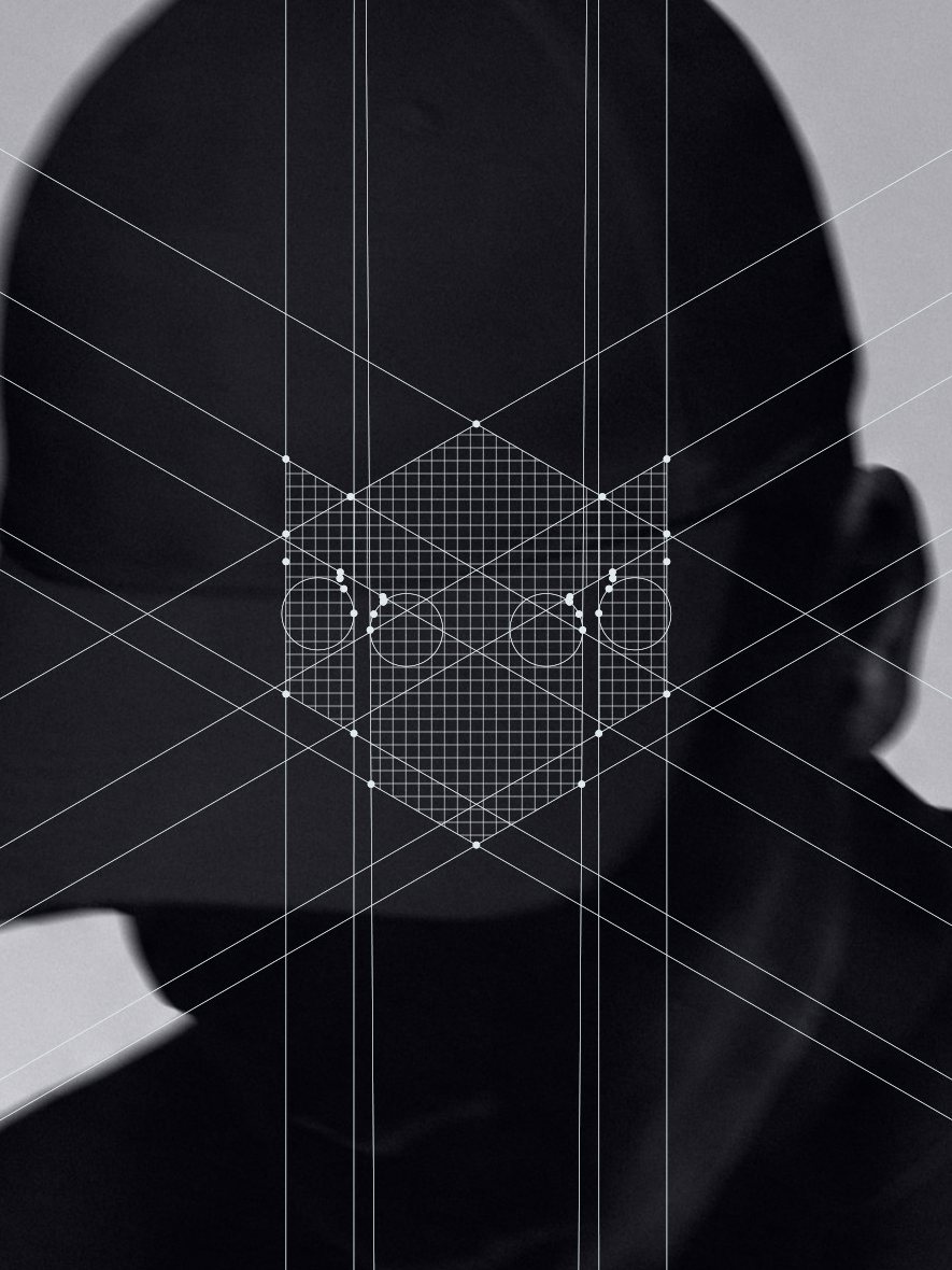
From there it was about precision. The icon sits on a strict geometric grid, so every angle and every gap is deliberate. The proportions are balanced, and the negative space does as much work as the black shape.
At first glance it reads as a bold, abstract mark. Look a little longer and the panther starts to appear: the ears, the eyes, the long nose.
That moment of discovery was the whole point. Minimal, premium and memorable, without spelling everything out.
A good logo does not need to explain everything at once. Sometimes its job is just to make people curious enough to remember it.
Made to be worn
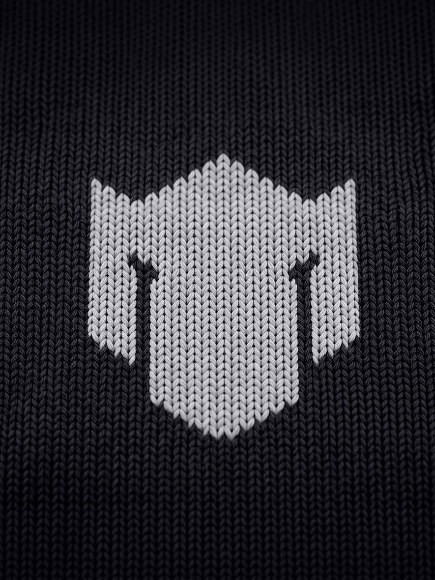
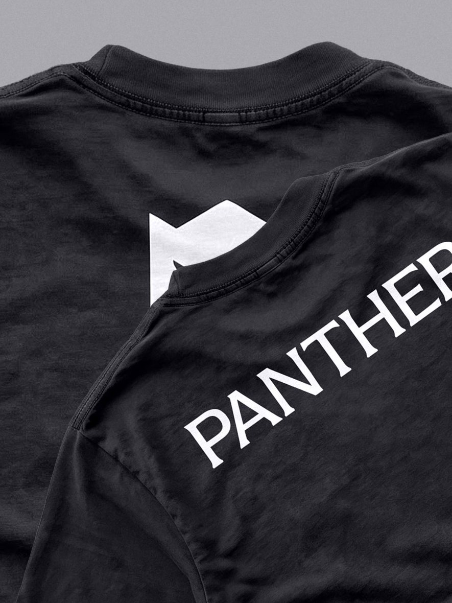
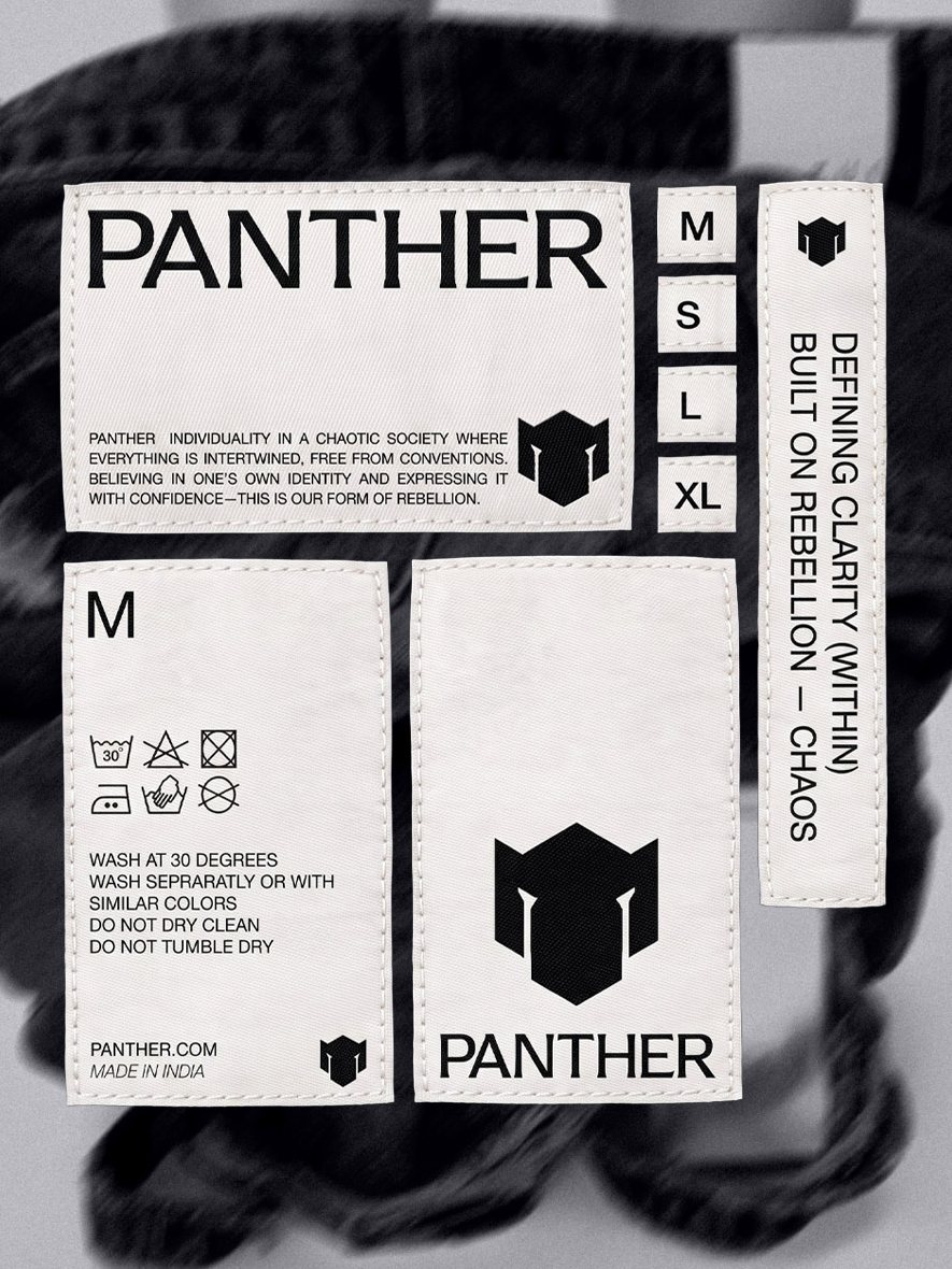
Because the mark is built from flat shapes, it holds up almost anywhere. It knits cleanly into fabric, prints large across the back of a T-shirt, and still reads on a small woven label next to the care instructions.
The wordmark sits alongside it in a clean, sharp typeface, confident without being loud. Together they give Panther a system that is ready for whatever it makes next.
What I took away
This project reminded me that good identity design does not start in Illustrator. It starts with research, with asking better questions, and with finding the place where strategy and simplicity meet.
The brief asked for a unique icon. The name could not give us that. The thinking had to.
Next project
Forge Destinations