Techplay

Where it started
Techplay is a new premium toy and mobile store in Kerala. Two very different shelves under one roof: phones and gadgets on one side, toys and games on the other.
When the client first came to me, he had a clear picture of the logo in his head. A mobile phone, a few toys and more, so that people could see everything he sells in one mark.
Less in the logo
I understood why he wanted that. But a logo is not a shop window. Its job is not to list your products, it is to be remembered.
So before drawing anything, I sat with him and talked it through. A good logo is simple, memorable and recognisable in a second. Put a phone, a teddy bear and a game controller in one mark and it turns into a small illustration. It gets lost on a phone screen, it is hard to print, and people forget it as soon as they look away.
He agreed to try a simpler route.

Two letters, one mark
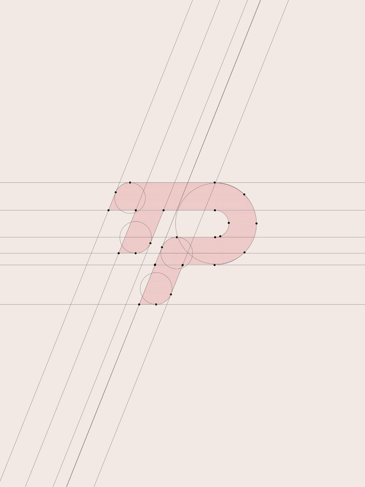
I built the mark from the two initials, T and P. The top bar of the T flows straight into the bowl of the P, so they read as one shape instead of two letters side by side.
Everything leans forward on the same angle. That slant gives it speed and energy, which suits a store full of gadgets and games. The corners are rounded where the strokes meet, so it stays friendly enough for a toy shop and not too hard or technical.
The whole mark sits on a small set of parallel guides and matching curves. That is what keeps it clean when it is tiny on an app icon or large on a shop sign.
A logo does not have to show everything you sell. It has to be the thing people remember.
Out in use
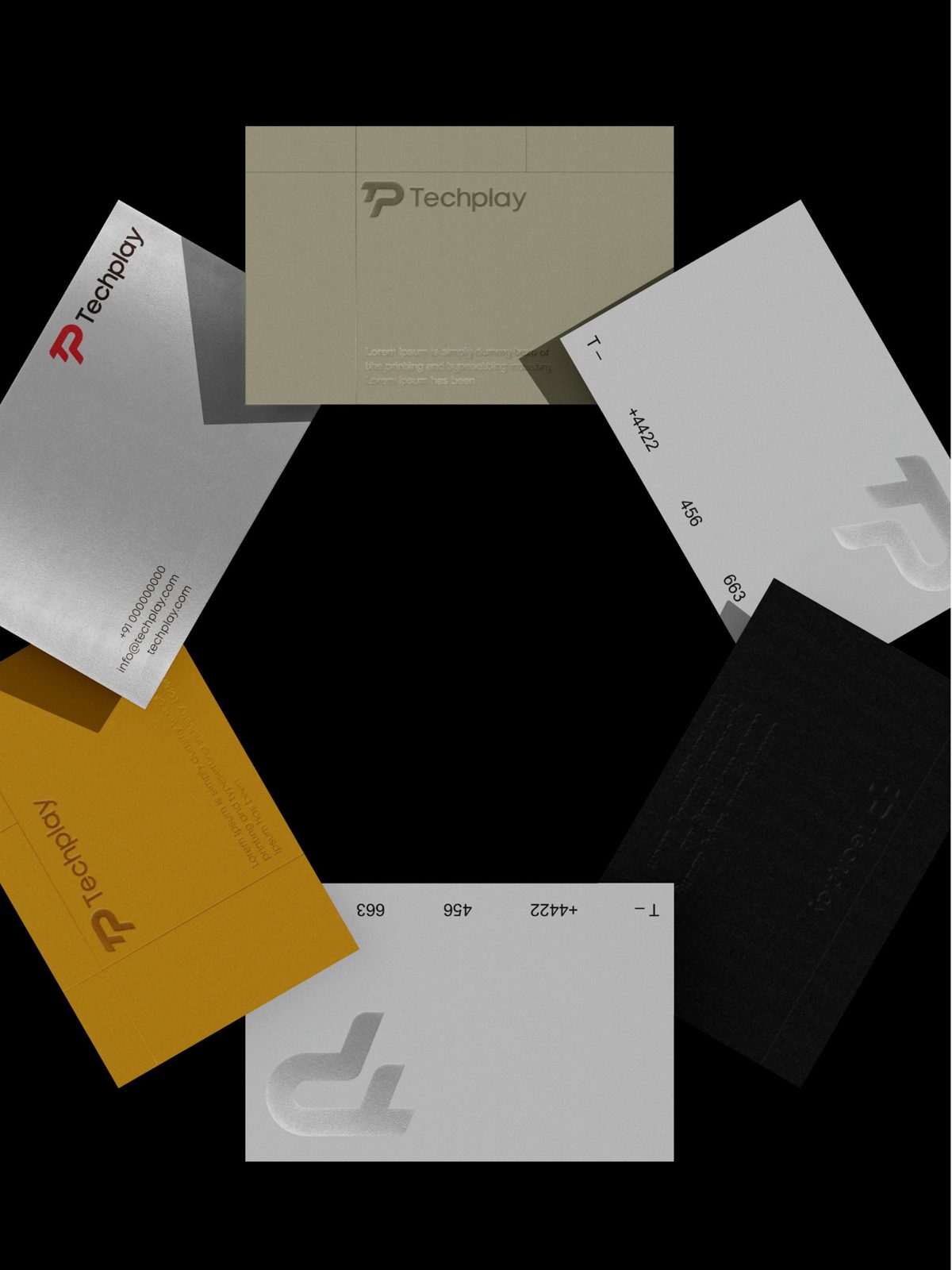
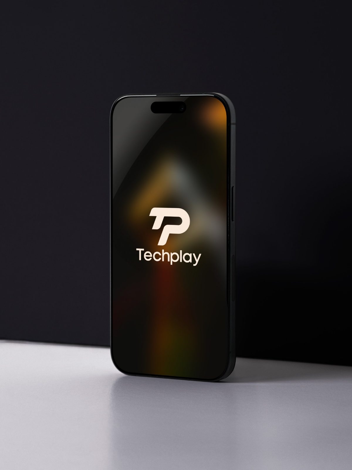
The red monogram does the heavy lifting. On business cards it works in print, foil or a simple emboss with no colour at all. On a phone it becomes the splash screen with nothing else around it.
Because the mark is just two letters, it can go anywhere the store goes next: shopping bags, price tags, the website, social posts.
What I took away
Sometimes the most useful part of a logo project happens before any design. Explaining why simple works, and earning the client's trust to try it, made the rest easy.
The final mark says nothing about phones or toys directly. It does something better. It looks like a brand people will remember.
Next project
Elya