Yemvi
Where it started
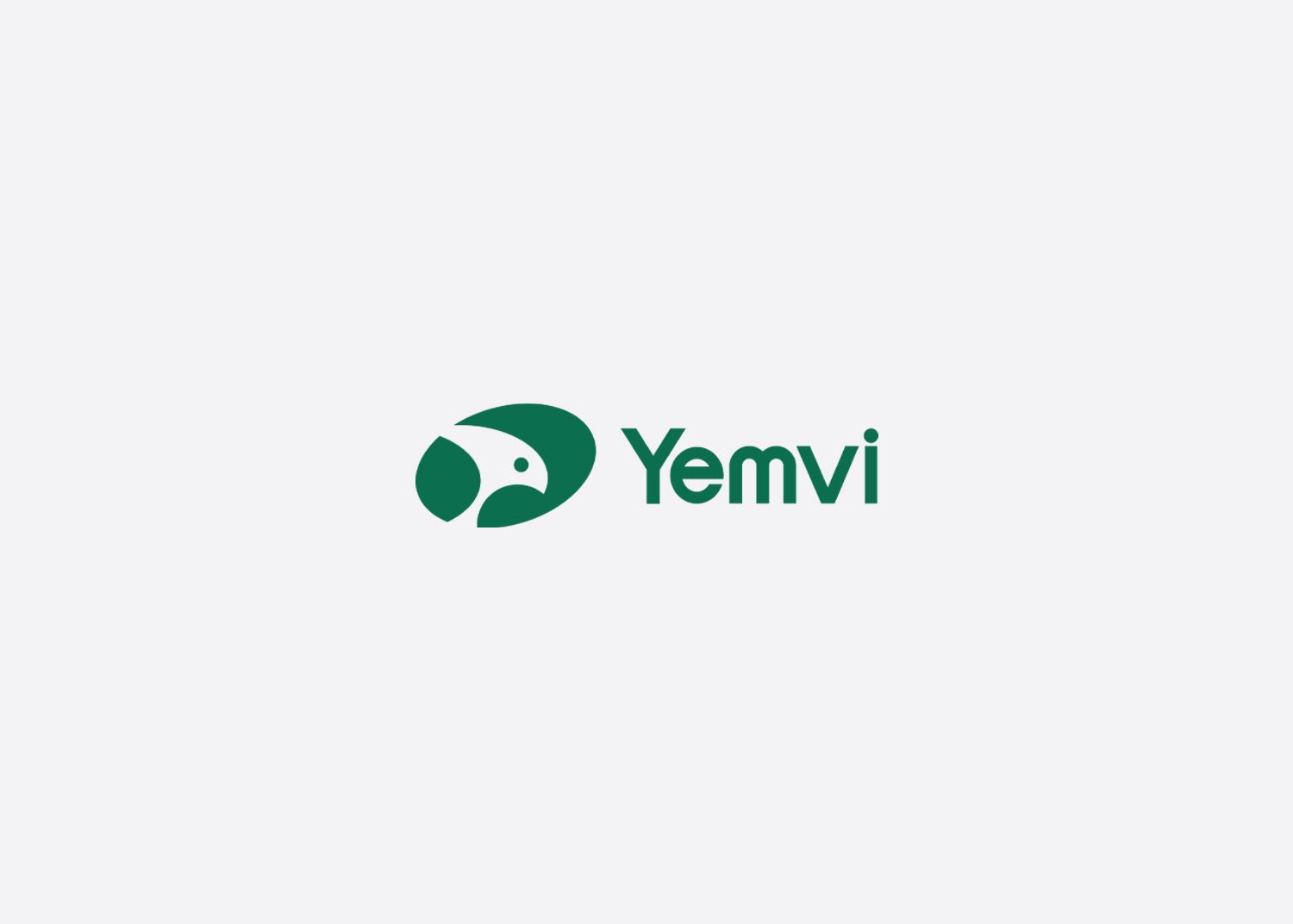
Yemvi Exports is an agricultural export company from India. They deal in luxury spices, essential oils and cashew products, and they take quality checks, ethical sourcing and reliable delivery seriously. Everything they ship is processed properly and ready for foreign markets.
The product was strong. The brand was not. Their old logo was a plain wordmark set in very basic type. It looked dated, and it said nothing about quality, trust or where the company wanted to go.
For an export business that matters more than people think. A buyer in another country often sees the logo, the website and the packaging long before they taste anything. If the brand looks ordinary, the product gets judged as ordinary too.
Looking at the market
Before drawing anything, we looked at who Yemvi was up against. We went through competitor brands and studied how the export market presents itself.
A pattern showed up quickly. Most brands looked alike: traditional type, spice illustrations, a lot of earthy brown and orange. Safe choices, but they all blend together on a shelf or a trade show stand.
That gave us the direction. Yemvi did not need to look like another spice exporter. It needed to look like a modern, premium company that happens to export spices, oils and cashews.
Why a falcon
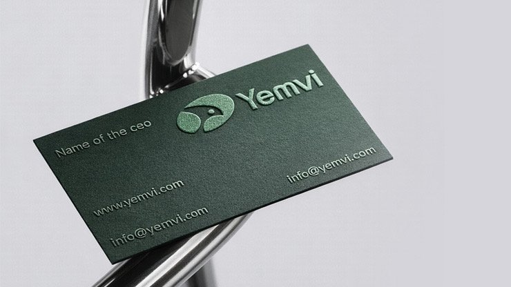
We wanted one strong symbol that could carry the whole brand, so we chose a falcon.
A falcon sees far and sees clearly. It covers long distances and it is not easily distracted. That felt right for a company that sends its products across the world and has to get the details right every single time.
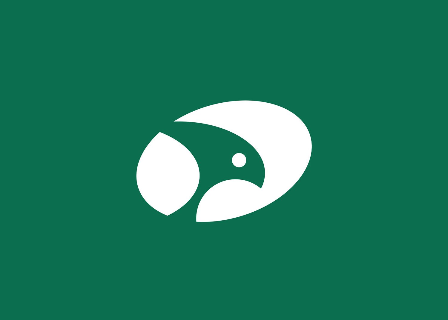
We used only the face. A full bird would have been too busy. The face is enough: the sharp beak, one eye, a few clean curves. It is simple enough to emboss on a card or stitch onto fabric and still read clearly.
The logo had to say quality and trust before a buyer ever opened the box.
Colour and type
For colour we went with a deep, premium green. It feels fresh, which suits natural products, but it also feels calm and dependable. It does not look like every other spice brand.
The type is a clean sans-serif. It keeps the brand modern and friendly, so it does not feel distant or overly corporate. Premium, but still easy to trust and easy to choose.

Where it lives now
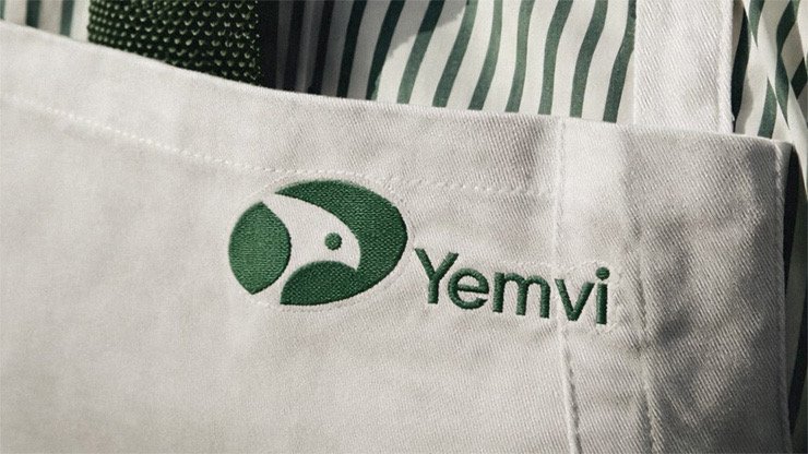
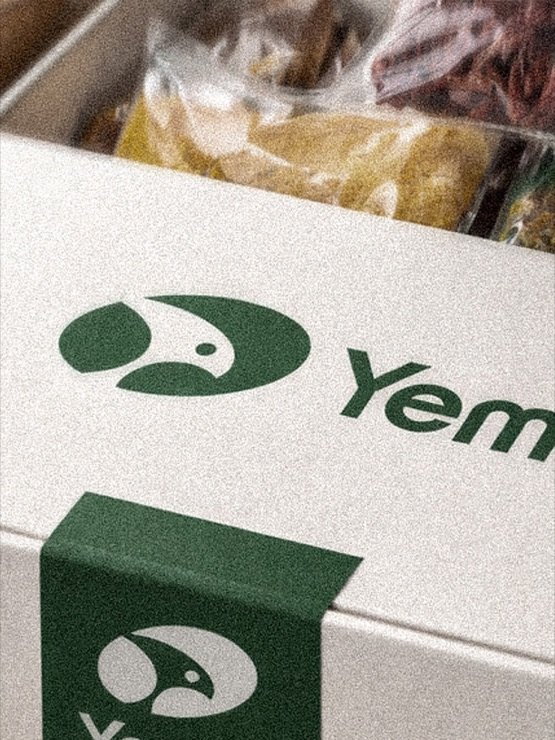
The identity now runs through stationery, packaging and workwear. On the business card the logo is embossed into the green. On the packaging the green band and the falcon do most of the work. Even stitched onto fabric, the mark holds its shape.
Yemvi now has a face that matches the quality of what it sells. It looks like a company you can rely on, and that is exactly what an export buyer is looking for.
Next project
Forge Destinations